⭐ Introduction
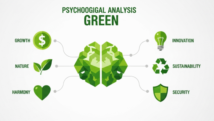
Green is one of the most universally appreciated colors. Deeply connected to nature, renewal, balance, and health, green carries emotional stability unlike any other hue. Designers often use green when they want to evoke harmony, growth, and trust. Because of its psychological depth, green is a highly flexible color for branding, UI/UX, product design, environmental design, and marketing campaigns.
This article explores the full philosophy behind the color green and how designers can apply it strategically.
🍃 The Philosophy of Green
Green symbolizes several powerful concepts:
🌱 1. Growth & Renewal
Green reflects new life, evolution, regeneration, and fresh beginnings.
Brands that want to communicate progress naturally gravitate toward green.
☘️ 2. Balance & Harmony
As a mid-spectrum color, green is visually easy on the eyes and creates a calming sense of stability.
It is a common choice for eco-friendly or wellness-focused visuals.
💚 3. Health & Healing
Green is widely used in medical, organic, wellness, and health-based branding.
It visually communicates calm, care, and safety.
🧘 4. Trust & Reliability
While blue creates corporate trust, green creates emotional trust.
It feels transparent, grounded, and sincere.
⚠️ 5. Toxicity or Envy (Contextual)
In some contexts, darker shades can symbolize jealousy or toxicity, showing how flexible yet powerful the color can be.
🎨 Best Uses of Green in Design
💼 1. Branding & Logos
Green is ideal for brands focusing on:
Sustainability
Finance
Natural products
Agriculture
Health & wellness
Technology (especially AI/green tech)
Famous brands using green:
Starbucks, Spotify, WhatsApp, Land Rover, Tropicana
📱 2. UI/UX & Web Design
Green works exceptionally well as an accent color.
Use green for:
Confirmation states (success messages, checkmarks)
Call-to-action buttons (Join Now, Buy, Confirm)
Progress indicators
Highlight elements
User onboarding screens
Avoid neon green in large areas — it causes visual fatigue.
🛍️ 3. Marketing & Advertising
Green can communicate:
ECO-FRIENDLY messaging
Savings and discounts
Calm and minimalistic lifestyle
Freshness or natural ingredients
Organic brands often combine green with textures like leaves, nature photos, or matte packaging.
📦 4. Product Design
Green is perfect for:
Skincare and beauty products
Health drinks
Eco-friendly packaging
Tech products promoting sustainability
Outdoor gear or sports equipment
Light green feels natural and soft.
Dark green feels premium and luxurious.
🏡 5. Environmental & Interior Design
Green spaces create calm and balance — a major reason why hospitals and spas use this color extensively.
Applications include:
Accent walls
Workspace environment
Calm-themed interiors
Wellness centers
Cafés with organic branding
🎯 Best Color Combinations With Green
| Combination | Effect |
|---|---|
| Green + White | Clean, natural, minimalist |
| Green + Brown | Eco-friendly, earthy |
| Green + Black | Premium, modern |
| Green + Yellow | Fresh, energetic |
| Green + Gold | Luxurious and elegant |
| Green + Blue | Calm, trustworthy |
🧠 Conclusion
Green is one of the most powerful and emotionally grounded colors in design. It symbolizes harmony, environmental awareness, growth, and trust. When used with the right shades and combinations, green can elevate brand identity and enhance user experience across platforms.
If your goal is to communicate renewal, honesty, sustainability, or health — green is your strongest visual ally.