flat design for mobile apps has become a dominant approach in modern user interface design. From productivity tools to e-commerce platforms, designers increasingly choose flat visuals to improve usability, performance, and consistency across devices. Because mobile users expect speed and clarity, this design style continues to evolve as a practical solution rather than a passing trend.
In this article, you will learn what flat design really means, why it works so well on mobile platforms, and how to apply it correctly without harming user experience. Additionally, you will discover best practices, real-world examples, and common mistakes to avoid.
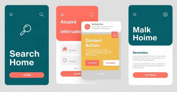
Understanding flat design for mobile apps
Flat design is a visual style that removes unnecessary decorative elements. It avoids heavy shadows, gradients, and textures. Instead, it focuses on clarity, color, typography, and spacing.
For mobile interfaces, this approach is especially effective. Smaller screens require efficient use of space. Therefore, flat design helps users focus on content and actions rather than visual noise.
Key characteristics include:
Solid color backgrounds
Simple iconography
Clean typography
Minimal UI elements
Clear visual hierarchy
However, flat design does not mean boring design. When used correctly, it creates elegant and intuitive mobile experiences.
Why flat design for mobile apps works so well
Several practical reasons explain the popularity of flat design for mobile apps.
First, flat interfaces load faster. Since they use fewer visual effects, they reduce processing demands. As a result, performance improves on low-end devices.
Second, flat layouts improve readability. Clear fonts and strong contrast help users scan content quickly. Therefore, accessibility also improves.
Third, flat design scales easily. Because it relies on vectors and grids, it adapts smoothly to different screen sizes and resolutions.
According to Google’s Material Design guidelines, simplicity and clarity are essential for mobile usability. You can review their official documentation here:
https://m3.material.io/
Core principles of flat design for mobile apps
To apply flat design effectively, you must understand its core principles.
Simplicity above all
Every element should serve a purpose. Remove anything that does not support user goals. For example, decorative shadows that add no function should be avoided.
Clear visual hierarchy
Use size, spacing, and color to guide attention. Important actions should stand out immediately. Therefore, users can complete tasks faster.
Consistent color usage
Flat design often relies on limited color palettes. Choose primary and secondary colors carefully. Additionally, ensure sufficient contrast for readability.
Typography-focused layout
Since visuals are minimal, text plays a larger role. Use legible fonts and consistent line spacing. Avoid overly decorative typefaces for body text.
flat design for mobile apps vs skeuomorphic design
Before flat design became popular, skeuomorphic design dominated mobile interfaces. Skeuomorphism imitates real-world objects, such as buttons that look like physical controls.
Flat design, however, removes these visual metaphors. Instead, it uses abstract cues like color and position.
Comparison overview:
Skeuomorphic design uses textures and shadows
Flat design uses clean shapes and colors
Skeuomorphism focuses on realism
Flat design focuses on usability and efficiency
While skeuomorphic design can feel familiar, flat design for mobile apps usually offers better performance and scalability.
Practical benefits for users and developers
Flat design does not only benefit users. Developers also gain advantages.
For users:
Faster navigation
Reduced cognitive load
Better readability
Cleaner visual experience
For developers:
Faster UI implementation
Easier maintenance
Better cross-platform consistency
Reduced asset complexity
Therefore, flat design becomes a strategic choice rather than a purely aesthetic one.
Common mistakes in flat design for mobile apps
Despite its simplicity, flat design can fail if applied incorrectly.
One common mistake is removing too much depth. When buttons look like plain text, users may not recognize them as interactive elements.
Another issue is poor contrast. Light text on light backgrounds reduces readability. Consequently, accessibility suffers.
To avoid these problems:
Use subtle shadows or color contrasts for clickable elements
Test designs under different lighting conditions
Validate accessibility with contrast tools
Flat design should remain functional, not minimal to the point of confusion.
Best practices to apply flat design correctly
To ensure success, follow these best practices.
Use color to indicate actions and states
Apply spacing consistently across screens
Maintain alignment using grid systems
Test interactions with real users
Combine flat visuals with micro-interactions
Additionally, consider adopting “flat 2.0,” which adds subtle depth through layering and motion. This approach preserves simplicity while improving usability.
Real-world examples of flat design for mobile apps
Many popular apps successfully use flat design principles.
Examples include:
Google Calendar with its clean color blocks
Spotify’s minimal navigation and typography
Airbnb’s simplified layouts and icons
These apps prove that flat design for mobile apps can be visually appealing and highly functional at the same time.
Typography and flat design for mobile apps
Typography plays a crucial role in flat interfaces. Since visual effects are limited, text clarity becomes essential.
Choose fonts with:
High legibility on small screens
Balanced letter spacing
Clear distinction between weights
Custom fonts can enhance brand identity. If you want to explore premium typography options, you can link to a font collection page such as:
[Insert internal link to related article here]
Performance and UX impact
Flat design positively impacts performance metrics. Fewer assets mean smaller app sizes. As a result, load times decrease.
From a UX perspective, users complete tasks faster. Clear layouts reduce decision fatigue. Therefore, retention rates often improve.
According to UX research, minimal interfaces help users focus on goals instead of decorations. This aligns perfectly with flat design philosophy.
Accessibility considerations
Accessibility should never be ignored. Flat design must still accommodate all users.
Important accessibility tips:
Maintain sufficient color contrast
Use readable font sizes
Ensure buttons are clearly identifiable
Support screen readers properly
By following these guidelines, flat design for mobile apps becomes inclusive and user-friendly.
Future trends in flat design for mobile apps
Flat design continues to evolve. Designers now blend it with motion design, subtle shadows, and responsive animations.
Upcoming trends include:
Soft gradients used sparingly
Micro-interactions for feedback
Adaptive layouts for foldable devices
Typography-driven UI systems
These innovations enhance flat design without compromising simplicity.
Conclusion
Flat design for mobile apps remains one of the most effective UI approaches for modern digital products. It improves performance, enhances usability, and supports scalability across devices. When applied thoughtfully, flat design delivers both aesthetic value and practical benefits.
By focusing on clarity, typography, spacing, and accessibility, designers can create mobile interfaces that feel modern and intuitive. Ultimately, flat design is not about removing elements, but about emphasizing what truly matters to users.
Frequently Asked Questions
Is flat design still relevant for mobile apps?
Yes, flat design remains highly relevant. It continues to evolve while maintaining its core principles of simplicity and usability.
Does flat design harm usability?
No, when applied correctly. Problems only arise when contrast and interaction cues are ignored.
Can flat design work for complex apps?
Yes. With strong hierarchy and spacing, flat design supports even feature-rich applications.
Is flat design suitable for all industries?
Most industries benefit from flat design. However, branding and audience expectations should guide final decisions.