Introduction to lettering
What is lettering is a question many beginners ask when entering the world of design. Lettering appears everywhere today. You see it on logos, packaging, posters, social media graphics, and merchandise. However, many people confuse lettering with typography or calligraphy. This guide explains lettering in a clear and practical way, based on real design experience and industry usage.
As a designer, understanding lettering helps you create unique visuals. It also improves brand recognition. Unlike ready-made fonts, lettering gives full control over every letter shape. Therefore, it offers creative freedom that standard typography cannot match.
What is lettering? A clear definition
What is lettering exactly? Lettering is the art of drawing letters by hand for a specific design purpose. Each letter is intentionally crafted. It is not typed or generated from a font file.
In lettering, every word becomes an illustration. The designer draws letters to fit a message, mood, and layout. As a result, lettering is custom by nature.
Key characteristics of lettering include:
Letters are drawn, not typed
Each composition is unique
Shapes are adjusted for balance and emotion
It is often used for logos and headlines
Because lettering is custom, it cannot be reused like a font. This exclusivity increases its value in branding.
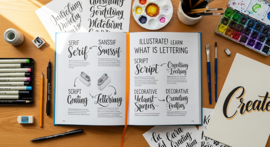
Lettering vs typography vs calligraphy
Many beginners struggle to see the difference. Understanding this comparison builds clarity and authority.
Lettering
Letters are drawn individually
Used for logos, posters, and branding
Custom and non-repeatable
Focuses on composition and expression
Typography
Uses existing fonts
Letters are arranged, not drawn
Efficient for long text
Focuses on readability and systems
Calligraphy
Letters are written with tools
Uses pens or brushes
Stroke contrast comes from pressure
Focuses on rhythm and flow
In professional design work, lettering often bridges illustration and typography. Therefore, it sits between art and communication. also read Lettering vs Typography: Key Differences, Uses, and Design Best Practices
The history and evolution of lettering
Lettering is not new. Ancient civilizations carved letters into stone and metal. These early forms were hand-drawn by necessity. Later, sign painters popularized lettering in shops and streets.
During the 20th century, advertising relied heavily on lettering. Designers drew headlines by hand to attract attention. Even after digital fonts became common, lettering remained relevant.
Today, lettering thrives again. Social media, branding, and digital illustration revived demand. Brands want personality. Lettering provides that human touch.
According to design observations from branding studios, hand-crafted visuals improve emotional connection. This explains the growing popularity of lettering in modern marketing.
Types of lettering styles
Lettering comes in many styles. Each style serves a different purpose.
Common lettering styles include:
Script lettering – Elegant and fluid
Sans serif lettering – Clean and modern
Serif lettering – Classic and formal
Brush lettering – Expressive and dynamic
Vintage lettering – Inspired by retro design
Decorative lettering – Artistic and bold
Choosing the right style depends on brand personality. For example, a café may use script lettering. Meanwhile, a tech brand may prefer clean sans serif lettering.
Tools used in lettering
Professional lettering artists use both traditional and digital tools.
Traditional tools:
Pencil and eraser
Brush pens
Ink pens
Paper or sketchbooks
Digital tools:
iPad with Procreate
Adobe Illustrator
Drawing tablets
Vector brushes
Many designers sketch by hand first. Then they digitize the work. This workflow preserves authenticity while allowing flexibility.
The lettering design process
Understanding the process builds trust and expertise.
A typical lettering workflow includes:
Research and concept planning
Sketching rough letterforms
Refining shapes and spacing
Inking or digitizing
Final adjustments and export
Spacing, balance, and rhythm matter more than decoration. Therefore, experienced designers focus on structure before details.
This process explains why lettering takes time. However, the results justify the effort.
Practical uses of lettering in branding
What is lettering used for in real projects? Lettering appears across many industries.
Common applications include:
Logo design
Product packaging
Apparel graphics
Editorial headlines
Social media campaigns
Event posters
Album covers
Brands use lettering to stand out. Custom letters communicate personality faster than stock fonts. Therefore, lettering strengthens visual identity.
For external reference, you can explore:
https://www.smashingmagazine.com/hand-lettering-guide/
Common mistakes beginners make
Beginners often rush the process. This reduces quality.
Frequent mistakes include:
Poor spacing between letters
Overdecorating shapes
Ignoring readability
Skipping sketching
Copying styles without understanding structure
Avoid these mistakes by practicing fundamentals. Structure always comes before style.
How to start learning lettering
You do not need expensive tools to start.
Begin with these steps:
Study letter anatomy
Trace professional lettering work
Practice basic shapes daily
Analyze spacing and balance
Redraw words instead of alphabets
Consistency matters more than talent. Many professionals improved through daily practice over several years.
Key Takeaways
Key Takeaways
Lettering is the art of drawing letters by hand
It differs from typography and calligraphy
Lettering adds personality and uniqueness
It plays a major role in branding
Practice and structure lead to improvement
Frequently Asked Questions
What is lettering in graphic design?
Lettering in graphic design refers to custom-drawn letters created for a specific design purpose.
Is lettering better than typography?
Lettering is not better, but different. Typography suits long text, while lettering suits custom visuals.
Can lettering become a font?
Yes, lettering can be converted into a font, but the original lettering remains custom artwork.
Do you need drawing skills for lettering?
Basic drawing skills help, but practice improves results over time.
Is lettering still relevant today?
Yes. Branding trends strongly favor hand-crafted visuals.
Conclusion
In conclusion, what is lettering goes beyond drawing letters. It represents creativity, intention, and identity. Lettering allows designers to create visuals that feel human and memorable. When used correctly, it strengthens branding and communication. As digital design evolves, lettering remains a powerful and relevant skill.