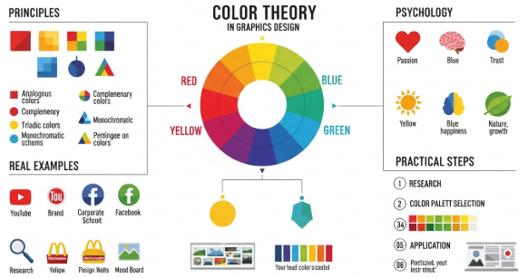
The Anatomy of a Letter

The Anatomy of a Letter

Typography is everywhere — from coffee cups to websites, street signs to movie posters. But have you ever looked closely at the shapes of letters? Just like the human body, each letter has an “anatomy” — a structure made of parts that give it character, function, and style.

Let’s take a closer look at the basic anatomy of a letterform:

✦ 1. Baseline
The invisible line where letters sit. It’s the foundation of every typeface.

✦ 2. Cap Height
The height of uppercase letters, like “H” or “T,” from the baseline.

✦ 3. X-Height
The height of lowercase letters (like “x”) — crucial for readability and type size perception.

✦ 4. Ascender
The part of a lowercase letter that rises above the x-height, like the stem of “h” or “l.”

✦ 5. Descender
The part of a letter that dips below the baseline, such as “y,” “g,” or “p.”

✦ 6. Stem
The main vertical or diagonal stroke of a letter. For example, the long vertical line in “L” or “B.”

✦ 7. Bowl
A curved, enclosed part of a letterform — like the round part of “b,” “d,” or “o.”

✦ 8. Counter
The empty space inside a letter. It can be fully enclosed (as in “o”) or partially open (as in “c”).

✦ 9. Serif
The small decorative lines or strokes added to the ends of main strokes in serif fonts. Think of Times New Roman.

✦ 10. Terminal
The end of any stroke that doesn’t have a serif — often rounded or tapered in sans-serif fonts.

✦ 11. Spine
The central curved stroke of the letter “S.” It’s like the backbone of the letter.

✦ 12. Leg & Arm
The leg is the slanted or vertical stroke sticking out from the body of a letter (like in “K”), while the arm is a horizontal or upward stroke (like in “E”).

✦ 13. Ligature
A combination of two or more letters merged into a single character — often seen in elegant typography (like “fi” or “fl”).

Why Does Letter Anatomy Matter?

Whether you’re a designer, a brand owner, or just someone who appreciates beautiful type, understanding letter anatomy helps you:

  • Choose fonts more intentionally

  • Customize lettering with confidence

  • Appreciate the details that make typefaces unique

Typography is not just about letters — it’s about voice, tone, and feeling. And once you know the anatomy, you’ll never see letters the same way again.

Typography for Beginners

Typography for Beginners: A Simple Guide to Beautiful Letters

Typography is everywhere—on websites, posters, books, packaging, and even your phone screen. But what exactly is it? Simply put, typography is the art of arranging letters and text in a way that makes the content readable, appealing, and effective.

Whether you’re a designer, a content creator, or just someone who loves cool fonts, understanding the basics of typography can help you communicate better through design.


1. What Is Typography?

Typography isn’t just about choosing a pretty font. It includes font selection, size, spacing, alignment, and layout. Good typography improves the user experience and makes your message stand out.


2. Know Your Font Types

There are four main types of fonts:

  • Serif: Classic and elegant. (e.g., Times New Roman)

  • Sans-Serif: Clean and modern. (e.g., Helvetica)

  • Script: Cursive and decorative. (e.g., Pacifico)

  • Display/Decorative: Bold and expressive, best for headlines.

Each type has its own mood and purpose. Use them wisely!


3. Basic Typography Terms

  • Kerning: Space between two individual letters.

  • Leading: Vertical space between lines of text.

  • Tracking: Space between letters across a whole word or paragraph.

  • Hierarchy: Visual arrangement that shows what text is most important (like titles and subtitles).

Understanding these will help you design text that’s easy to read and visually balanced.


4. Tips for Better Typography

  • Limit your fonts: Stick to 1–2 fonts per design.

  • Use contrast: Mix sizes, weights, or styles to create interest.

  • Align carefully: Left-aligned text is easiest to read.

  • Check readability: Avoid small fonts or low contrast colors.

  • Be consistent: Use the same font rules across your project.

Install font for Windows and Mac

Install Font for Windows and Mac

Installing fonts on your computer is a simple process that can dramatically enhance your design work, documents, and presentations. Whether you’re a designer looking to use a custom font or just want to spice up your Word documents, here’s how to install fonts on both Windows and macOS systems.

How to Install Fonts on Windows

There are several ways to install fonts in Windows, but the most common and easiest method is through a simple right-click. Here’s how:

1. Download the Font File

Fonts are usually downloaded as .ZIP files. Extract the files inside the ZIP — you should find font files with extensions like .TTF (TrueType Font) or .OTF (OpenType Font).

2. Install the Font

Method 1:

  • Right-click the .TTF or .OTF file.

  • Click “Install” to install it for your current user.

  • Alternatively, click “Install for all users” (requires admin access).

Method 2:

  • Open the Control Panel.

  • Go to Appearance and Personalization → Fonts.

  • Drag and drop the font file into the Fonts folder.

3. Use the Font

Once installed, the font will be available in applications like Microsoft Word, Adobe Photoshop, Illustrator, and others.

How to Install Fonts on Mac

Installing fonts on macOS is just as straightforward. Here’s how to do it:

1. Download the Font File

After downloading and unzipping the font package, locate the .TTF or .OTF file.

2. Install the Font

Method 1:

  • Double-click the font file.

  • The Font Book app will open.

  • Click “Install Font” to complete the process.

Method 2:

  • Open the Font Book app directly.

  • Drag and drop your font file into the Font Book window.

3. Use the Font

The font will now be available in most applications, including Pages, Keynote, Adobe Creative Suite, and Microsoft Office.

Tips & Troubleshooting

  • Restart the app you’re using if the font doesn’t appear immediately.

  • Ensure you download fonts from trusted sources to avoid corrupted files or malware.

  • If a font doesn’t work properly, try restarting your computer.

Best Serif Font For Branding

Best Serif Font for Branding – A Zeenesia Studio Perspective

When it comes to building a strong brand identity, typography plays a crucial role especially serif fonts. Serif fonts evoke a sense of tradition, reliability, and timeless elegance. At Zeenesia Studio, we believe the right serif font can become the voice of your brand, speaking volumes through subtle details and refined craftsmanship.

What Makes a Great Serif Font for Branding?

A great branding serif should strike the perfect balance between uniqueness and legibility. It should carry enough personality to stand out while remaining versatile across multiple media—from packaging to digital platforms.

Here’s what to look for in a serif font:

  • Distinctive Character Shapes: Unique terminals, contrast, and flair that set your brand apart.

  • Versatility: A font family with various styles (Regular, Italic, Bold) offers flexibility in design.

  • Emotional Tone: Depending on the brand, the font can feel classic, modern, luxurious, or friendly.

  • High-Quality Craftsmanship: Clean vector paths and consistent spacing are essential for professional use.

Zeenesia Studio’s Top Serif Picks for Branding

At Zeenesia Studio, we’ve crafted several serif fonts that have become favorites among designers and brand builders. Here are our top choices:

  1. Milky Bright
    Milky Bright is the serif sibling of our popular Sugar Magic font. It brings a gentle elegance and a playful spirit—ideal for lifestyle brands, packaging, or editorial design. Its rounded edges and soft contrast make it approachable yet refined.

  2. Chavora
    A bold and expressive serif, Chavora features unique curves and sharp serifs that exude confidence and luxury. Perfect for fashion brands, high-end products, and striking logos, it’s a font that commands attention while retaining sophistication.

  3. Loviena
    For brands seeking a romantic, graceful look, Loviena delivers with its classic beauty and modern proportions. It’s great for boutique brands, beauty products, and upscale stationery.

  4. Marine Elmoure
    With four elegant styles—Regular, Italic, Bold, and Bold Italic—Marine Elmoure offers complete typographic control. Its timeless form makes it suitable for editorial branding, luxury design, and corporate identities that require clarity with flair.

Why Choose Zeenesia Studio Fonts?

Each serif typeface we design is thoughtfully crafted with branding in mind. Our fonts are not just letters—they’re stories waiting to be told through packaging, logos, headlines, and campaigns. We combine modern aesthetics with timeless design principles to help your brand leave a lasting impression.

Final Thoughts

Choosing the right serif font can transform how your audience perceives your brand. Whether you’re aiming for elegance, authority, or charm, Zeenesia Studio offers typefaces that help your message resonate.

Explore our full collection and find the perfect serif font to elevate your brand.

Let me know if you’d like this turned into a blog post, Instagram caption, or press kit version.

Best Font For Logo

Best Font for Logo: A Guide to Making the Right Choice

When it comes to logo design, every detail matters—but perhaps none more than the font you choose. The right typeface not only communicates your brand’s identity but also leaves a lasting impression on your audience. So, what makes a font the best for a logo? Let’s explore the key considerations and top font styles to help you decide.

Why the Font Matters in Logo Design

A logo is more than just a name; it’s a visual expression of your brand. The font plays a crucial role in shaping how your brand is perceived. A playful handwritten font can suggest creativity and fun, while a sleek sans-serif font can evoke professionalism and modernity.

Key Factors to Consider

When choosing a font for your logo, keep these essential factors in mind:

  1. Legibility
    Your logo should be easy to read at any size. Avoid overly complex or decorative fonts unless they’re still clearly legible.

  2. Uniqueness
    A distinctive font helps your logo stand out. Look for typefaces with unique characteristics or consider using a custom font.

  3. Scalability
    Your logo should look great on a business card and a billboard. Choose a font that maintains its clarity and impact at various sizes.

  4. Brand Personality
    Your font should reflect your brand’s voice. A tech startup may lean toward clean sans-serifs, while a luxury brand might prefer elegant serifs.

  5. Timelessness
    Trendy fonts might look good now, but timeless fonts ensure your logo remains relevant for years.

Best Font Styles for Logos

Here are some font categories that work particularly well in logo design:

1. Sans-Serif Fonts

Clean, minimal, and modern—sans-serif fonts like Helvetica, Futura, or Montserrat are often used by tech and lifestyle brands.

2. Serif Fonts

Elegant and classic, serif fonts like Baskerville, Garamond, or Playfair Display work well for brands wanting to convey tradition or luxury.

3. Script Fonts

Script fonts bring personality and elegance. Use with caution—they can be hard to read in small sizes. Good examples include Pacifico, Great Vibes, or custom calligraphy styles.

4. Display Fonts

Highly stylized fonts that are often custom-made. These can make a bold statement and set your brand apart if used correctly.

5. Handwritten Fonts

Ideal for brands with a casual, friendly, or artistic tone. Handwritten styles add a personal touch to your logo.

Custom Fonts: The Ultimate Choice

If you want a truly unique logo, consider commissioning a custom typeface. Many iconic brands like Coca-Cola and Google use custom fonts to ensure their logo is one of a kind.

Final Thoughts

There’s no one-size-fits-all answer to the “best” font for a logo—it all depends on your brand’s identity and goals. Whether you go for a sleek sans-serif or a bold display font, the key is to choose a typeface that communicates your message clearly and memorably.

Take your time to explore options, test different pairings, and consider consulting a professional designer if needed. The perfect font is out there—it just needs to be discovered.


If you’d like this in a more casual tone, formatted for a blog, or translated into Indonesian, just let me know!

How Use Open Type Fitures Font

How Use Open Type Fitures Font

Typefaces include many characters in addition to the ones you see on your keyboard. Depending on the font, these characters can include ligatures, fractions, swashes, ornaments, ordinals, titling and stylistic alternates, superior and inferior characters, old‑style figures, and lining figures. A glyph is a specific form of a character. For example, in certain fonts, the capital letter A is available in several forms, such as swash and small-cap.

There are three ways to insert alternate glyphs:

  • The Selection in-context menu lets you view and insert glyphs available for a selected character.
  • The Glyphs panel lets you view and insert glyphs from any typeface.
  • The OpenType panel lets you set up rules for using glyphs. For example, you can specify that you want to use ligatures, titling characters, and fractions in a given text block. Using the OpenType panel is easier than inserting glyphs one at a time and ensures a more consistent result. However, the panel works only with OpenType fonts.

Replace a character with on-canvas alternate glyphs

When you’re working on a type object, you can select a character to quickly view alternate glyphs right next to it in the in-context menu. Simply click the alternate glyph to replace the character with it.

Note:

Illustrator displays a maximum of five alternate glyphs for a selected character on the canvas. If more than five alternatives are available, Illustrator displays the  icon to the right of the displayed alternate glyphs. Click the  icon to open the Glyphs panel and view more alternatives.


Glyphs panel overview

You use the Glyphs panel (Window > Type > Glyphs) to view the glyphs in a font and insert specific glyphs in your document. By default, the Glyphs panel displays all the glyphs for the currently selected font. You can change the font by selecting a different font family and style at the bottom of the panel. If any characters are currently selected in your document, you can display alternate characters by selecting Alternates For Current Selection from the Show menu at the top of the panel.

A. Show menu B. Font family C. Font style D. Zoom buttons

When you select an OpenType font in the Glyphs panel, you can restrict the panel to display certain kinds of glyphs by selecting a category from the Show menu. You can also display a pop‑up menu of alternate glyphs by clicking the triangle in the lower right corner of the glyph box where applicable.