A flat design color palette plays a critical role in modern digital design. It shapes how users perceive a brand, interact with an interface, and interpret visual hierarchy. Designers value flat design because it uses simple forms, minimal shadows, and clean color blocks. Therefore, the flat design color palette becomes more than just an aesthetic choice. It becomes a functional tool that improves clarity, usability, and communication across screens and platforms.
Choosing the right flat design color palette helps designers create interfaces that feel intuitive and pleasant. In addition, it aligns brand identity with user experience. Because flat design removes depth and gradients, color must carry greater weight in guiding attention and expressing emotion. Therefore, refined color decisions improve both aesthetics and performance.
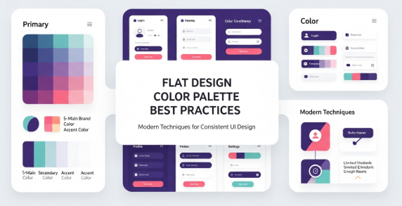
Understanding the importance of a flat design color palette is the first step. Next, you must explore how to select colors correctly, how to test them in real use cases, and how to apply them across UI components. This guide gives you actionable steps, practical examples, and insights grounded in current industry standards.
What Makes a Flat Design Color Palette Effective
An effective flat design color palette balances simplicity and contrast. It uses fewer shades, avoids heavy gradients, and focuses on harmony. Consequently, each color must be chosen carefully. The flat design trend values modern minimalism, legibility, and accessible contrast levels.
Key characteristics include:
Limited color range
Strong but simple contrasts
Accent colors for hierarchy
Neutral base tones
High readability
Accessibility compliance
The flat design color palette also emphasizes versatility. It should work across dark and light backgrounds, large and small components, mobile and desktop screens. To achieve that, designers consider palette flexibility early in the process.
Moreover, good palettes enhance user attention. Instead of overwhelming the viewer with gradients and textures, a flat design color palette uses bold but controlled hues. This approach simplifies scanning and strengthens comprehension.
Understanding Color Theory for Flat Design
Designers who master color theory can build stronger flat design color palettes. Hue, saturation, value, and contrast all matter. Although flat design avoids complex textures, color interactions still shape emotions and usability.
Consider:
Complementary colors create strong contrast.
Analogous colors support harmony.
Monochromatic palettes establish stability.
Split-complementary schemes balance contrast and calmness.
Additionally, the psychological effect of color cannot be ignored. For example, blue conveys trust and calmness. Red signals urgency and action. Green communicates growth and balance. When you choose a flat design color palette, consider both emotional resonance and readability.
Practical Steps to Build a Flat Design Color Palette
Follow these steps to craft a palette that supports clarity and appeal:
Start with a neutral base: gray, white, off-white, or charcoal.
Select one primary brand color that represents the product identity.
Add accent colors for CTA buttons, alerts, and highlights.
Ensure strong contrast for text and icons.
Test the palette in light and dark modes.
Validate accessibility using WCAG guidelines.
Create color tokens for consistent usage.
Additionally, preview the palette in common UI components:
Headers
Navigation bars
Cards
Buttons
Icons
Backgrounds
This preview ensures your flat design color palette works in real context, rather than just in theory.
Tools for Creating and Testing a Flat Design Color Palette
Several tools help designers evaluate and refine palettes. They support color mixing, contrast testing, and accessibility validation. For example, the Material Design color guidelines offer practical advice and standards for digital products. You can explore them at https://material.io/design/color for authoritative guidance and up-to-date best practices.
Other helpful tools include:
Adobe Color
Coolors
Color Contrast Checker
HueSnap
Paletton
These tools streamline experimentation. Furthermore, they allow you to visualize how colors interact. Because flat design emphasizes clarity, such testing is essential for success.
Applying a Flat Design Color Palette in UI/UX
Once you finalize the palette, apply it strategically. Start with background layers and modular components. After that, ensure CTA buttons and interactive elements use the strongest accent colors. This approach improves recognition and boosts conversions.
Methods for applying the palette include:
Mapping colors to component tokens
Defining light and dark variations
Building accessible text contrast
Establishing hover and active states
Additionally, think about cross-platform consistency. Flat design color palettes must be scalable across:
Mobile apps
Websites
Software dashboards
Marketing collateral
Consistency supports brand recognition and user familiarity.
Accessibility Considerations
Accessibility is essential in flat design. Because shadows and gradients are limited, readability depends on color contrast. Therefore, designers must follow WCAG contrast guidelines. A flat design color palette succeeds when everyone, including users with visual impairments, can interact with it comfortably.
Key accessibility practices include:
Contrast ratio of 4.5:1 for body text
Testing color blindness variants
Avoiding color as the only communication method
Providing alternative visual cues
As a result, an accessible flat design color palette enhances inclusivity and usability.
Trends in Flat Design Color Palettes
Modern flat design continues to evolve. Although simplicity remains a core principle, new trends introduce fresh expressions. Currently, designers favor:
Soft pastel hues for relaxed interfaces
Bold neons for futuristic themes
Muted earth tones for sustainability branding
High-contrast duotone setups
Minimal monochromatic palettes
In addition, micro-interactions and motion graphics influence palette decisions. Flat design no longer excludes subtle depth. Instead, it blends minimalism with modern vibrancy.
Common Mistakes to Avoid When Building a Flat Design Color Palette
Even experienced designers make mistakes. You can avoid them by recognizing the pitfalls below.
Mistakes include:
Using too many colors
Ignoring accessibility
Overusing similar shades
Neglecting user context
Focusing only on aesthetics
Because flat design prioritizes clarity, palettes must support usability. Poor contrast or excessive complexity reduces effectiveness.
Case Studies and Real-World Applications
Real products demonstrate how flat design color palettes succeed:
Banking apps use blues and grays for trust and professionalism.
Fitness platforms use vibrant greens and oranges for energy.
Lifestyle brands use pastels for calm and elegance.
Productivity tools use bold accents for focus.
This diversity shows how a flat design color palette adapts across industries. Therefore, designers should tailor their palette to the target audience and brand message.
Workflow Integration
Integrating a flat design color palette into a design workflow increases consistency. Document colors in a style guide. After that, export palette tokens into the design system. Because teams often collaborate across locations, documentation ensures alignment.
Moreover, developers benefit from clear palette naming. UI libraries, CSS variables, and token systems contribute to reproducibility. Thus, product quality improves.
Conclusion
A thoughtful flat design color palette strengthens digital products through simplicity, clarity, and functionality. When designers use color intentionally, they create accessible and visually appealing interfaces. Moreover, this approach enhances branding and supports consistent user experience. Therefore, adopting strong palette practices is essential for modern design. By learning theory, testing tools, and applying structured workflows, you can master flat design color palettes and elevate your work effectively.
Zeenesia Studio – Fonts that elevate your project.