The Ultimate Guide to Choosing the Perfect Font for Your Brand
Typography is more than just choosing letters—it’s about creating identity, emotion, and connection. In today’s digital world, the right font can instantly communicate your brand’s personality, while the wrong one can confuse—or even drive your audience away.
Before people read your message, they see your font. And that first impression happens in milliseconds.
Why Fonts Matter More Than Ever
With the rapid growth of online businesses, social media, and digital products, visual identity has become a key differentiator.
Fonts play a crucial role in shaping how people perceive your brand. Whether you’re building a website, designing social media content, or creating marketing materials, typography sets the tone before your message is even read.
A strong font choice can:
- Build trust instantly
- Improve readability
- Strengthen brand identity
- Make your content more memorable
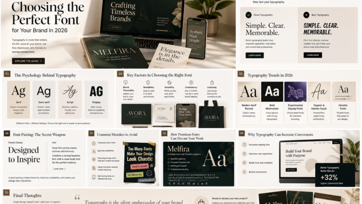
The Psychology Behind Typography
Fonts don’t just look different—they feel different. Each typeface carries a psychological impact:
- Serif fonts → trustworthy, classic, elegant
- Sans-serif fonts → modern, clean, approachable
- Script fonts → personal, creative, expressive
- Display fonts → bold, unique, attention-grabbing
This is why major brands carefully choose their typography—it directly influences how audiences perceive credibility and value.
Key Factors in Choosing the Right Font
Choosing a font isn’t just about what looks good—it’s about what works best for your purpose.
1. Brand Personality
Your font should reflect your brand voice. A luxury brand and a playful startup should never use the same typography style.
2. Readability
A beautiful font is useless if it’s hard to read. Always test your font in different sizes and contexts.
3. Versatility
Your font should work across multiple platforms—desktop, mobile, print, and even video.
4. Consistency
Using too many fonts creates visual chaos. Strong brands usually stick to 2–3 font styles.
5. Licensing Matters
For commercial projects, always use properly licensed fonts to protect your work and maintain professionalism.
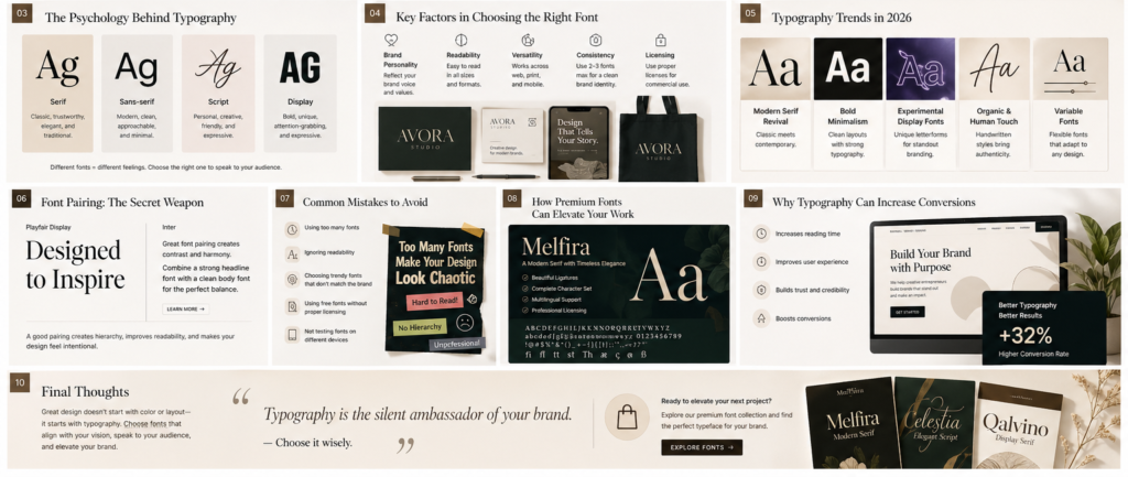
Typography Trends in 2026
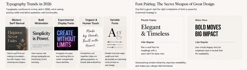
Typography continues to evolve, and in 2026 we’re seeing a blend of aesthetics and functionality:
Modern Serif Revival
Classic serif fonts are making a comeback—with cleaner, more contemporary shapes.
Bold Minimalism
Clean layouts with strong typography are dominating UI and branding.
Experimental Display Fonts
Unique and eye-catching fonts are being used to create standout visual identities.
Organic & Human Touch
Handwritten and imperfect styles are gaining popularity as brands seek authenticity.
Variable Fonts
Flexible fonts that adapt weight and style dynamically are becoming essential in modern web design.
Font Pairing: The Secret Weapon of Great Design
One font is good—but the right combination of fonts is powerful.
Common pairing strategies:
- Pair a serif font for headings with a sans-serif for body text
- Use a bold display font for emphasis and a neutral font for readability
Good font pairing creates hierarchy, improves readability, and makes your design feel intentional and professional.
Common Mistakes to Avoid
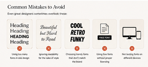
Even experienced designers make these mistakes:
- Using too many fonts in one design
- Ignoring readability for style
- Choosing trendy fonts that don’t match the brand
- Using free fonts without proper licensing
- Not testing fonts across different devices
Avoiding these mistakes alone can significantly improve your design quality.
How Premium Fonts Can Elevate Your Work
Free fonts are everywhere—but premium fonts offer something more: quality, uniqueness, and professionalism.
With premium fonts, you get:
- Better kerning and spacing
- Complete character sets (including multilingual support)
- Unique designs not overused by others
- Proper licensing for commercial use
For designers, agencies, and businesses, this is a small investment with a big impact.
Why Typography Can Increase Conversions
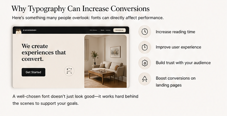
Typography isn’t just about aesthetics—it directly affects performance.
Better typography can:
- Increase reading time
- Improve user experience
- Build trust with your audience
- Boost conversions on landing pages
A well-chosen font doesn’t just look good—it works behind the scenes to support your goals.
Final Thoughts
Typography is one of the most powerful tools in design. Choosing the right font is not just a visual decision—it’s a strategic one.
In a world where attention is limited and competition is everywhere, the details matter—and fonts are one of the most impactful details you can control.
If you want your work to stand out in 2026, don’t just follow trends. Choose fonts that align with your vision, speak to your audience, and elevate your brand.
Because great design doesn’t start with color or layout—it starts with typography.