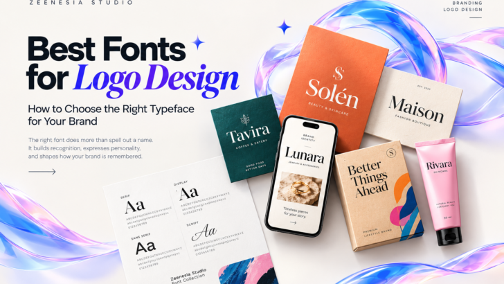
Best Fonts for Logo Design: How to Choose the Right Typeface for Your Brand
A great logo does more than identify a business. It communicates personality, builds recognition, and creates a lasting impression. While colors, symbols, and graphic elements all contribute to a brand’s visual identity, typography is often the element that brings everything together.
Choosing the best fonts for logo design is therefore one of the most important decisions in the branding process. The right typeface can make a brand feel luxurious, modern, playful, sophisticated, or timeless. The wrong one can make even a well-designed logo feel inconsistent with the brand it represents.
Whether you are a professional logo designer, a brand identity specialist, or a business owner developing a new visual identity, understanding how typography influences perception will help you make more confident design decisions.
In this guide, we explore different font styles for logo design, how to choose the right typeface for different industries, and what to consider when building a professional brand identity.
Why Typography Matters in Logo Design
Typography is more than a way to display a brand name. It is a visual language that communicates the character and values of a business.
Consider the difference between a high-contrast serif typeface and a bold geometric sans serif. The serif may communicate elegance, heritage, and sophistication, while the geometric sans serif may feel contemporary, confident, and innovative.
Neither style is universally better. The best choice depends on the brand’s positioning, target audience, industry, and personality.
A carefully selected typeface can help a logo achieve several goals:
- Build brand recognition: Distinctive letterforms help a brand become easier to recognize and remember.
- Communicate brand personality: Typography creates an immediate impression before a customer reads any supporting message.
- Improve visual consistency: A well-chosen typeface can connect the logo with packaging, websites, advertising, and social media.
- Differentiate a business: Original typographic choices can help a brand stand apart from competitors using similar visual styles.
- Support long-term branding: A versatile typeface can remain useful as the brand expands into new products, platforms, and markets.
For designers, typography should never be treated as an afterthought. It deserves the same consideration as composition, color, and the overall creative direction.
1. Serif Fonts: Timeless, Elegant, and Sophisticated
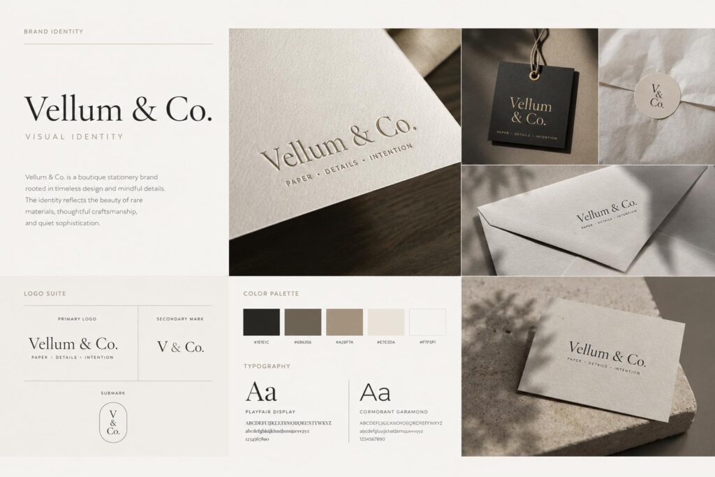
Serif fonts are characterized by small finishing strokes at the ends of letterforms. Depending on their construction, they can communicate tradition, luxury, editorial refinement, or contemporary sophistication.
Serif typography is particularly effective for brands that want to establish a premium image.
Common applications include:
- Luxury fashion and beauty brands
- Jewelry and accessories
- Boutique hotels and hospitality
- Premium skincare and cosmetics
- Editorial and lifestyle publications
- High-end food and beverage packaging
Explore our collection of premium fonts for logo design and discover typefaces that bring personality, character, and distinction to every brand identity :
Modern serif fonts with high contrast, refined proportions, and distinctive details can create an elegant visual identity without requiring complicated graphic elements.
However, not every serif font communicates luxury. Traditional slab serifs, soft rounded serifs, and contemporary display serifs each have different personalities. Designers should select a style that reflects the brand rather than relying on the serif category alone.
Design tip: Test the typeface in uppercase and lowercase. Pay attention to the shapes of letters such as A, G, R, S, and ampersands, as these details can significantly influence the overall character of a wordmark.
2. Sans Serif Fonts: Modern, Clean, and Versatile
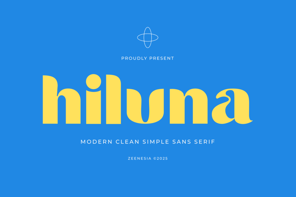
Sans serif fonts do not have the finishing strokes associated with serif typefaces. Their clean construction makes them popular in contemporary branding.
Depending on their proportions and weight, sans serif fonts can feel minimalist, technical, friendly, bold, or highly sophisticated.
They are frequently used for:
- Technology companies and digital products
- Creative studios and design agencies
- Contemporary fashion labels
- Fitness and lifestyle brands
- Modern consumer products
- Corporate identities
Geometric sans serifs often feature structured, balanced forms, while humanist sans serifs can feel warmer and more natural. Condensed sans serifs may create a strong, editorial impact, whereas lighter styles can communicate simplicity and elegance.
The versatility of sans serif typography makes it an excellent starting point for designers working across multiple industries.
Design tip: Avoid choosing a typeface simply because it looks minimal. Examine the individual letterforms, spacing, proportions, and overall rhythm to find a font that gives the brand a recognizable voice.
3. Display Fonts: Distinctive Typography for Memorable Logos
Display fonts are designed to attract attention and communicate a strong visual personality. They often feature unusual proportions, expressive curves, distinctive terminals, or other memorable characteristics.
For logo designers, display typography can provide a creative starting point for developing a distinctive wordmark.
Display fonts work particularly well for:
- Fashion and streetwear labels
- Creative businesses
- Music and entertainment brands
- Beauty and lifestyle products
- Restaurants, cafés, and specialty food brands
- Packaging and promotional campaigns
For designers looking for expressive typography, Sugar Magic offers a distinctive style for creative logos, packaging, and memorable brand identities. Explore Sugar Magic to see how it can inspire your next project.
Unlike neutral text fonts, display typefaces can become a defining element of the entire identity. Their distinctive letterforms may inspire custom lettering, monograms, graphic patterns, and supporting visual assets.
Nevertheless, readability remains essential. An expressive font should make the brand name more memorable without making it unnecessarily difficult to recognize.
Design tip: Use display fonts selectively. A highly expressive typeface may work beautifully for the primary logo while a simpler companion font handles supporting text, product information, and digital communication.
4. Script Fonts: Personal, Elegant, and Expressive
Script fonts are inspired by handwriting, calligraphy, or lettering created with a brush or pen. They can introduce movement, personality, and a sense of craftsmanship to a visual identity.
Depending on their style, script fonts can feel romantic, luxurious, casual, artistic, or energetic.
They are commonly used for:
- Wedding and event brands
- Boutique beauty businesses
- Personal brands
- Artisan products
- Specialty cafés and bakeries
- Lifestyle and fashion labels
Script typography is especially effective when the brand needs a personal or expressive character. However, overly elaborate letterforms can become difficult to read at small sizes.
When using script fonts in logo design, consider the length of the brand name, the complexity of the letter connections, and the clarity of the final composition.
Design tip: Check how the first and last letters interact with the rest of the wordmark. Natural-looking entry and exit strokes can help create a more balanced and intentional result.
5. Bold and Condensed Fonts: Confident and Impactful
Bold and condensed typefaces are useful when a brand needs to communicate strength, energy, or confidence.
Their strong visual presence makes them effective for logos that must stand out on packaging, merchandise, signage, or digital advertisements.
Typical applications include:
- Sports and fitness brands
- Streetwear and apparel
- Gaming and entertainment
- Automotive businesses
- Food and beverage products
- Contemporary lifestyle brands
Condensed fonts can also be useful when working with long brand names or narrow layouts. Their proportions allow designers to create impactful wordmarks without occupying excessive horizontal space.
However, heavy typography can lose clarity when letters are crowded together. Spacing and optical balance are especially important when working with bold weights.
Design tip: Compare several weights before committing to one. A medium or semibold style may provide a better balance between personality and readability than the heaviest option in the family.
6. How to Choose the Right Font for Your Brand Identity
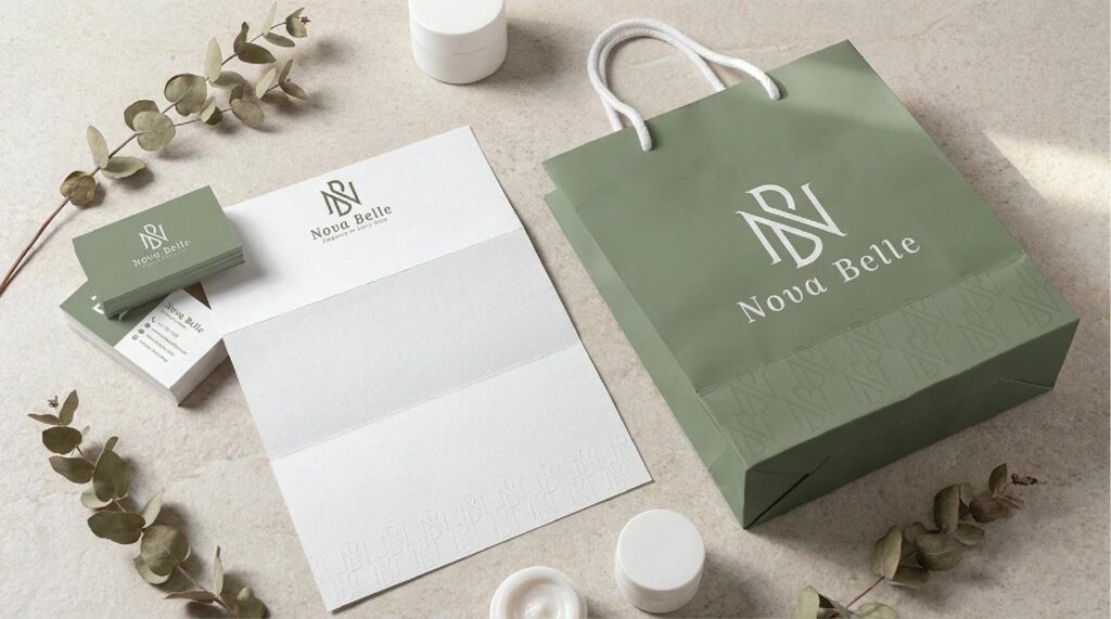
The best font for a logo is not necessarily the most fashionable or visually impressive typeface. It is the one that communicates the right message to the intended audience.
Use the following process when selecting typography for a branding project.
Understand the Brand Personality
Start by identifying three to five characteristics that describe the brand.
For example, a premium skincare brand might be described as refined, calm, modern, and trustworthy. A streetwear label might be bold, rebellious, energetic, and youthful.
These characteristics provide a useful filter for evaluating potential typefaces.
Research the Target Audience
Typography communicates differently to different audiences. A playful display font may work for a youth-oriented product but feel inappropriate for a professional financial service.
Research the expectations, preferences, and visual references associated with the intended market. The goal is to create an identity that feels relevant without simply copying competitors.
Explore Multiple Typography Directions
Avoid selecting the first font that looks attractive. Explore several contrasting directions, such as a contemporary serif, a geometric sans serif, and an expressive display typeface.
Presenting different directions can help clarify which visual language best supports the brand strategy.
Evaluate the Letterforms
Examine the specific letters in the brand name. Some typefaces have beautiful individual characters but awkward combinations when used in a particular word.
Look closely at kerning, letter spacing, proportions, curves, terminals, and the overall balance of the wordmark.
A professional logo often requires optical adjustments beyond the font’s default spacing.
Test the Logo at Different Sizes
A logo must work across a variety of applications, from large signage to small website headers and social media avatars.
Test the design at realistic sizes and on different backgrounds. Pay particular attention to thin strokes, intricate details, and tight letter spacing that may become less legible when reduced.
Consider the Entire Brand System
A logo rarely exists in isolation. The typography should work alongside the brand’s color palette, imagery, supporting graphics, website, packaging, and marketing materials.
A well-planned font selection helps create a consistent visual language that can grow with the business.
7. What Makes a Font Suitable for Professional Logo Design?
Beyond visual appearance, professional designers should consider several practical characteristics when choosing a typeface.
Distinctive letterforms
A memorable typeface offers recognizable shapes and thoughtful details. These characteristics can help a wordmark feel more individual, especially in competitive markets.
Useful weights and styles
A font family with multiple weights can provide flexibility across headings, supporting typography, packaging, and digital applications. However, a logo does not need every available weight; select the styles that best serve the identity.
Kerning and spacing
Good spacing helps letters feel visually balanced. Even a beautiful font may require manual kerning or other optical adjustments to achieve a polished logo.
Language support
If a brand operates internationally, check whether the font includes the characters and diacritics required for its target languages.
Technical quality
Review the font files, character coverage, rendering, and compatibility with the design software used in the project.
Licensing
Always verify that the font license permits the intended use. Logo creation, commercial branding, client work, and embedding fonts on websites may be governed by different license terms.
The exact permissions depend on the foundry and the license purchased. If the project involves a large company, multiple users, or extensive advertising, review the relevant license carefully before delivery.
8. Should You Use One Font or Combine Multiple Fonts?
Many strong brand identities use a single typeface, while others combine two complementary fonts to create contrast and hierarchy.
Both approaches can work well.
A single typeface can produce a cohesive, minimal identity. This approach is particularly effective when the font already has a distinctive personality and sufficient flexibility.
Combining fonts can create more visual depth. For example, a refined serif may establish the brand’s personality, while a clean sans serif provides clarity for supporting information.
When pairing fonts, consider the following principles:
- Create contrast with purpose: Combine different characteristics rather than choosing two fonts that look almost identical.
- Maintain a shared visual direction: The fonts should support the same brand personality, even when their structures differ.
- Establish a clear hierarchy: Decide which typeface leads and which one supports the communication.
- Limit unnecessary variety: Too many typefaces can make a brand feel inconsistent and difficult to recognize.
For many branding projects, two carefully selected typefaces are enough to create a versatile visual system.
9. Common Typography Mistakes in Logo Design
Even experienced designers can overlook details that affect the quality of a final identity.
Here are several common mistakes worth avoiding.
Choosing a font based only on trends. A popular typeface may look appealing today but fail to communicate the brand’s actual personality. Trends can provide inspiration, but brand strategy should guide the final decision.
Ignoring readability. Decorative letterforms and tight spacing may look impressive in a large presentation but become difficult to recognize in smaller applications.
Using too many fonts. Excessive typeface variation can weaken consistency and make the identity feel less intentional.
Forgetting about scalability. A logo should remain recognizable across different sizes, materials, and digital environments.
Overlooking font licensing. A font downloaded for personal experimentation may not automatically be licensed for commercial branding. Always confirm the permitted usage.
Failing to customize the wordmark. A font can provide an excellent foundation, but careful kerning, optical adjustments, and considered modifications may be necessary to make the final logo distinctive.
The goal is not to make a logo complicated. It is to make every typographic decision contribute to a clear and recognizable identity.
10. Where to Find High-Quality Fonts for Logo Design
Finding the right typeface can take time, particularly when a branding project requires a specific visual direction.
Professional font foundries and independent type designers offer a wide range of typefaces for different creative applications, from elegant serif fonts to modern sans serifs and expressive display families.
When exploring fonts for logo design, look for collections that provide:
- Clear specimen images showing the font’s character
- Useful examples of uppercase and lowercase letters
- Multiple weights or styles when the project requires flexibility
- Relevant language support
- Reliable font files and installation instructions
- Licensing information appropriate for the intended project
It is also helpful to shortlist fonts by project category. A fashion identity may benefit from expressive editorial typography, while a technology brand may require a cleaner and more functional visual language.
At Zeenesia Studio, designers can explore typefaces created for branding, logo design, editorial work, packaging, and other visual identity projects. Discover different typographic styles and find a font that aligns with the creative direction of your next project.
Explore the font collection at Zeenesia Studio to find inspiration for your next brand identity.
Final Thoughts
Choosing the best fonts for logo design requires more than finding a typeface that looks attractive. It involves understanding brand personality, audience expectations, visual communication, and the practical demands of the final identity.
Serif fonts can communicate elegance, sans serif typefaces offer versatility, display fonts provide individuality, script fonts introduce personality, and bold condensed styles create impact. Each category has its own strengths, and the right choice depends on the purpose of the brand.
For designers, the most effective approach is to explore different typographic directions, evaluate individual letterforms, test readability, and consider how the selected font will function across the entire brand system.
A well-chosen typeface does more than spell out a name. It helps transform that name into a recognizable visual identity.
Explore Zeenesia Studio’s font collection and discover typography for your next logo design and branding project.