Logo Design Trends 2027: 10 Branding Ideas for Creative Designers
Logo design continues to evolve as brands search for new ways to communicate their identity, connect with audiences, and stand out in an increasingly competitive market. As we approach 2027, designers have more creative possibilities than ever, from expressive typography and simplified symbols to flexible visual identities built for digital platforms.
However, effective logo design is about more than following trends. A successful logo should communicate a brand’s personality, remain recognizable across different applications, and create a lasting impression.
In this article, we explore 10 logo design trends and creative directions to watch in 2027, along with practical ideas for graphic designers, branding specialists, and logo designers looking to create distinctive visual identities.
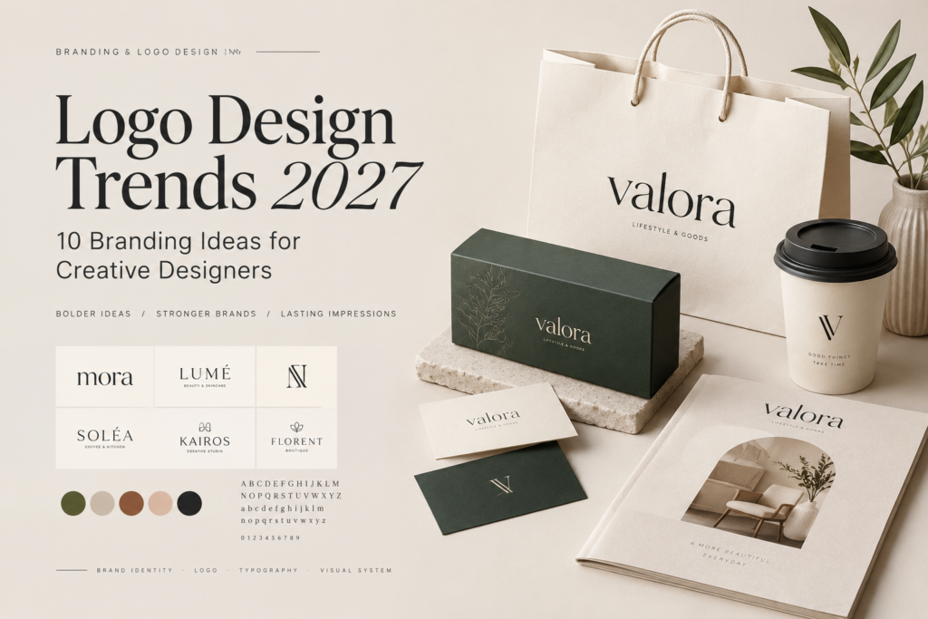
1. Expressive Typography in Logo Design
Typography is one of the most powerful tools in visual branding. A carefully selected typeface can communicate personality, emotion, and positioning even before an audience understands what a business offers.
Expressive typography takes this idea further by transforming lettering into a distinctive visual feature. Unusual proportions, dramatic curves, custom ligatures, and unexpected letter combinations can help create logos that feel unique and memorable.
This approach works particularly well for:
- Fashion and lifestyle brands
- Beauty and cosmetics businesses
- Creative studios
- Coffee shops and restaurants
- Independent clothing labels
- Personal branding projects
For designers, the key is finding the right balance between originality and readability. A logo can have a distinctive personality without sacrificing clarity.
2. Minimalist Logos with Strong Recognition
Minimalism remains a valuable approach for brands that need a clean, versatile, and professional identity.
Rather than relying on decorative details, minimalist logos focus on essential shapes, balanced proportions, thoughtful spacing, and clear visual communication. Every element should have a purpose.
A simple symbol or wordmark can become highly recognizable when its design is distinctive and consistently applied.
Minimalist logo design is especially useful for technology companies, modern service businesses, architecture studios, and brands that want a timeless visual identity.
When creating a minimalist logo, avoid simplifying the design so much that it becomes generic. The goal is not merely to remove details, but to preserve the most meaningful characteristics of the brand.
3. Modern Serif Wordmarks
Serif typography offers a compelling combination of sophistication, heritage, and visual character. With the right proportions and details, serif typefaces can make a brand feel refined without appearing outdated.
Modern serif wordmarks often explore high contrast, elegant curves, sharp terminals, and distinctive letterforms. These characteristics can create a strong visual identity for businesses that want to communicate quality and attention to detail.
Consider using modern serif typography for:
- Luxury and premium brands
- Fashion labels
- Boutique hotels
- Beauty and skincare products
- Editorial and publishing businesses
- Premium food and beverage packaging
Typography can become the primary visual asset of a brand, especially when the wordmark is carefully customized.
For a more distinctive result, experiment with letter spacing, alternate characters, ligatures, and subtle modifications to selected letters. Always check that the final design remains legible at smaller sizes.
4. Geometric Symbols and Abstract Shapes
Geometric shapes provide a versatile foundation for creating modern brand symbols. Circles, squares, triangles, and custom geometric forms can communicate structure, movement, balance, or connection.
Abstract logos take this concept further by using simplified shapes to represent a brand’s ideas rather than depicting a literal object.
For example, overlapping shapes might communicate collaboration, while a continuous line could represent connection or progress. The meaning should relate to the brand strategy rather than being added as decoration.
This direction is useful for technology companies, consulting firms, architecture studios, digital agencies, and contemporary lifestyle brands.
When working with abstract symbols, prioritize distinctive silhouettes and balanced proportions. A symbol should remain recognizable without relying on color or complex visual effects.
5. Retro-Inspired Branding with a Modern Touch
Retro aesthetics continue to provide a rich source of inspiration for branding projects. Vintage typography, nostalgic lettering, classic badges, and traditional emblem structures can create a sense of familiarity and character.
The opportunity for designers is to reinterpret these visual references rather than simply reproduce them.
A retro-inspired logo might combine vintage lettering with contemporary spacing, a simplified emblem, or a restrained color palette. The result can feel nostalgic while remaining relevant to modern audiences.
This approach is particularly suitable for:
- Coffee and specialty beverage brands
- Restaurants and bakeries
- Apparel and merchandise
- Barbershops
- Craft products
- Music and entertainment projects
To avoid making a brand look outdated, consider which historical elements genuinely support its personality. A thoughtful combination of old and new can be more effective than using every vintage detail at once.
6. Custom Lettering and Bespoke Wordmarks
As more designers explore existing typefaces and digital design resources, custom lettering offers an opportunity to create something more specific to a brand.
A bespoke wordmark can include individually drawn letters, unusual connections, customized terminals, or unique proportions that would be difficult to achieve with an unmodified font.
Even small adjustments can make a significant difference. Changing the shape of one letter, creating a distinctive ligature, or refining the relationship between characters can help transform ordinary typography into a recognizable brand asset.
Custom lettering is particularly effective for fashion labels, boutique businesses, creative studios, premium products, and personal brands.
For logo designers, the process begins with understanding the brand’s character. Before drawing letters, define whether the identity should feel elegant, playful, bold, organic, futuristic, or traditional.
The strongest custom wordmarks connect these visual decisions to a clear brand concept.
7. Flexible Logo Systems for Digital Platforms
A modern brand rarely uses its logo in just one place. It may appear on a website, mobile application, social media profile, product label, business card, presentation, and advertising campaign.
A flexible logo system helps maintain consistency across these different environments.
Instead of relying on a single logo configuration, designers can develop a coordinated set of variations, such as:
- Primary logo
- Secondary logo
- Compact logo
- Monogram or brand symbol
- Social media avatar
- Horizontal and stacked arrangements
Each version should serve a specific purpose while preserving the same visual identity.
For example, a detailed wordmark might work well on packaging or a website header, while a simplified symbol is more practical for a small profile image.
When developing a logo system, test every variation at different sizes and on different backgrounds. Flexibility should improve usability without making the brand feel inconsistent.
8. Bold Shapes and Confident Visual Identities
Some brands need to communicate energy, strength, and confidence immediately. Bold shapes, heavy lettering, strong silhouettes, and clear visual hierarchy can help achieve this effect.
This approach is especially useful when a logo needs to compete for attention in crowded visual environments, such as retail packaging, sports merchandise, event graphics, and advertising.
Bold branding does not necessarily mean using oversized typography or aggressive shapes. It means making deliberate visual choices that give the identity a clear presence.
Designers can experiment with condensed typefaces, thick strokes, simplified symbols, and strong contrasts between positive and negative space.
The important consideration is context. A bold visual identity should reflect the brand’s positioning and audience rather than simply trying to attract attention.
9. Playful Branding and Organic Forms
Not every brand needs to look formal or corporate. Playful typography, rounded shapes, irregular lines, and organic symbols can make a visual identity feel approachable, friendly, and human.
This direction is particularly relevant to brands that want to communicate creativity, warmth, optimism, or a relaxed lifestyle.
Potential applications include children’s products, independent cafés, creative businesses, handmade goods, lifestyle brands, and casual food packaging.
Designers can introduce personality through unusual letterforms, soft curves, illustrated symbols, or unexpected combinations of shapes.
However, playful branding still requires structure. Consistent spacing, thoughtful proportions, and a coherent visual language help prevent the identity from looking random or unprofessional.
10. Distinctive Brand Identities Beyond the Logo
One of the most important principles in contemporary branding is that a logo alone does not define an entire brand identity.
A recognizable brand often relies on a coordinated visual system that includes typography, color palettes, graphic elements, image treatments, layouts, packaging, and digital applications.
These elements work together to create a consistent experience across customer touchpoints.
For example, a skincare brand might combine an elegant serif wordmark with a restrained color palette, spacious layouts, and refined packaging. A creative lifestyle brand might use expressive typography, vibrant colors, and flexible graphic patterns.
The logo provides a foundation, but the broader identity gives designers more opportunities to communicate the brand’s personality.
For branding professionals, this means considering how a logo will function within a complete visual system from the beginning of the design process.
How to Choose the Right Logo Design Direction
Understanding design trends is useful, but not every visual approach is suitable for every project. Before choosing a style, consider the following questions.
What does the brand stand for?
Identify its values, personality, positioning, and main point of difference. A premium fashion label may need a different visual language from a playful food brand.
Who is the target audience?
Consider the expectations, preferences, and visual references that matter to the intended customers. Design decisions should support the brand’s relationship with its audience.
Where will the logo appear?
A logo used primarily on packaging may have different practical requirements from one used in mobile applications or social media profiles. Test the design in its real-world contexts.
Does the design feel distinctive?
A logo should not simply look attractive. It should help the brand establish a recognizable identity. Explore multiple concepts and compare them against the brand strategy.
Can the identity grow with the business?
Consider whether the logo and its supporting visual elements can accommodate new products, services, campaigns, and platforms without losing consistency.
Essential Tips for Creating Better Logos
Regardless of the visual direction you choose, a disciplined design process can improve the final result.
- Start with research. Understand the brand, its audience, its competitors, and its market positioning before exploring visual concepts.
- Explore multiple ideas. Develop different conceptual directions instead of polishing the first idea that looks appealing.
- Prioritize typography. Letterforms, spacing, and proportions can have a major influence on the personality of a wordmark.
- Test in black and white. A strong logo should not depend entirely on color to communicate its shape and structure.
- Check scalability. Review the design at small and large sizes, from social media avatars to signage and printed materials.
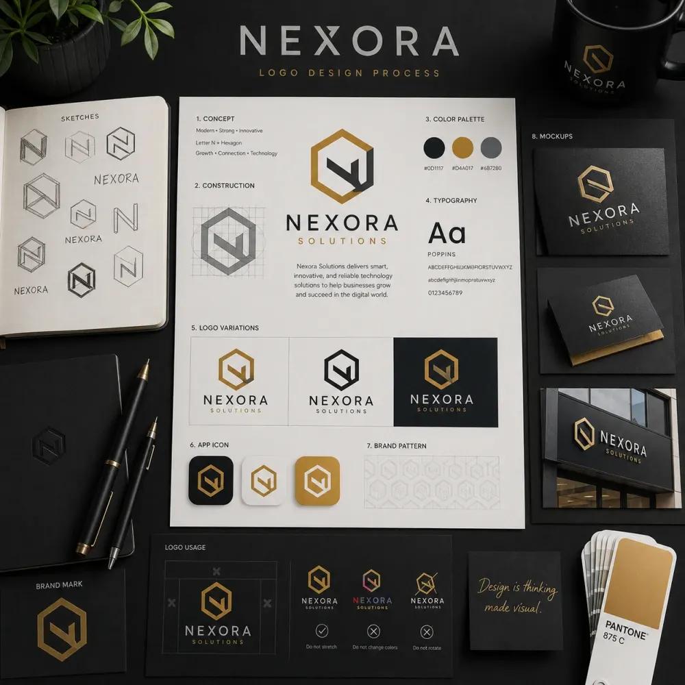
- Build a consistent system. Define how the logo, colors, typography, and supporting graphics work together.
- Present realistic applications. Use relevant mockups to demonstrate how the identity could appear on packaging, stationery, websites, or other brand touchpoints.
A professional logo is not simply a beautiful graphic. It is a practical design solution that connects strategy, aesthetics, and usability.
Final Thoughts
Logo design in 2027 offers plenty of creative possibilities, from expressive typography and modern serif wordmarks to abstract symbols, playful lettering, and flexible identity systems.
For graphic designers, branding specialists, and logo designers, these directions provide starting points for exploring new ideas and developing stronger visual concepts.
However, the most effective design is not necessarily the one that follows the latest trend. It is the one that communicates the brand’s character, connects with its intended audience, and remains recognizable across different applications.
Whether you are creating a logo for a luxury label, a coffee shop, a technology company, or an independent creative business, thoughtful typography and a well-developed visual identity can turn a simple mark into a meaningful brand asset.
Looking for creative inspiration for your next branding project? Explore the font collections at Zeenesia Studio to discover typefaces for logo design, brand identity, packaging, editorial layouts, and other creative projects.
Discover your next creative typeface with Zeenesia Studio.