How to Make Your Brand Look Premium with the Right Fonts
A premium brand is not defined by its price tag, logo, or color palette alone. The way a brand communicates visually plays an equally important role in shaping how people perceive its value.
One of the most powerful elements in that process is typography.
The right typeface can make a brand feel sophisticated, confident, modern, or effortlessly elegant. The wrong one can create confusion, weaken its personality, and make even a well-designed identity feel ordinary.
Whether you are building a fashion label, a beauty brand, a boutique business, or a modern lifestyle company, understanding premium brand typography can help you create a more distinctive and professional visual identity.
In this guide, we will explore how to choose fonts that communicate quality, combine typefaces effectively, and create a consistent brand presence across logos, packaging, websites, and marketing materials.
1. Understand What Makes Typography Feel Premium
Premium typography is not simply about using an expensive-looking serif font or making every letter thin and elegant.
It is about choosing type that communicates the right personality while maintaining clarity, balance, and consistency.
Several characteristics often contribute to a premium typographic appearance.
Refined letterforms
Some typefaces feature high contrast between thick and thin strokes, elegant curves, distinctive terminals, or carefully shaped proportions. These details can create a sophisticated impression when used appropriately.
High-contrast serif fonts, for example, are often associated with fashion editorials, luxury beauty products, and refined lifestyle brands.
However, a well-designed sans serif can also feel premium through precise geometry, balanced spacing, and restrained styling.
Intentional spacing
Letter spacing has a significant influence on how typography feels.
Generous tracking can create an airy, editorial appearance, especially in uppercase headlines. Tighter spacing can feel more compact, assertive, and contemporary.
The key is to avoid applying the same spacing treatment to every font. Different letterforms require different adjustments.
Strong visual consistency
A premium identity usually feels intentional across every touchpoint. The logo, website headings, packaging, social media graphics, and promotional materials should look as though they belong to the same brand.
A carefully selected type system helps create this consistency without making every design look identical.
2. Choose a Font Style That Matches Your Brand Personality
Before choosing a font, define the impression you want your brand to create. A typeface should support the brand’s positioning rather than simply follow a visual trend.

Elegant serif fonts
Best suited to fashion labels, premium beauty products, editorial publications, boutique hospitality, and brands that want to communicate refinement.
Look for distinctive contrast, graceful curves, and well-balanced proportions.

Modern sans serif fonts
Suitable for technology companies, contemporary lifestyle brands, creative studios, and businesses that value clarity and confidence.
Look for carefully constructed letterforms, balanced widths, and a consistent rhythm.
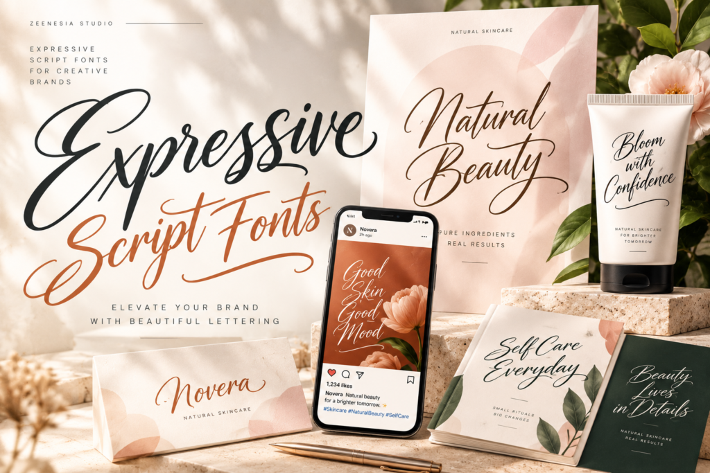
Expressive script fonts
Useful for boutique products, beauty packaging, invitations, signature-style logos, and brands that need a more personal character.
Use them selectively to create a recognizable accent rather than sacrificing readability.
There is no single font category that automatically makes a brand look expensive. The most effective choice is the one that supports the intended audience, product positioning, and overall art direction.
3. Use Typography to Build a Distinctive Brand Identity
A common mistake in branding is selecting a font because it looks attractive in a font preview without considering how it will function in a real identity.
Instead, evaluate the typeface in context.
Ask yourself:
Does it reflect the character of the product or service?
Does it remain recognizable when used in a logo?
Does it work across different sizes and layouts?
Does it look distinctive without becoming difficult to read?
Can it maintain its personality across digital and printed materials?
For example, a fashion brand may benefit from a refined serif wordmark paired with understated supporting text. A contemporary creative studio might use a bold sans serif for its logo and a more neutral typeface for body copy.
The goal is not to make typography decorative for its own sake. It is to create a visual language that people can associate with your brand.
4. Combine Fonts Without Making Your Design Look Cluttered
Using two complementary typefaces can introduce contrast and hierarchy. Using too many unrelated fonts can make a brand identity feel inconsistent.
For many projects, a simple combination is enough.
Try a serif and sans serif pairing
A serif headline paired with a clean sans serif body font is a versatile starting point for premium branding.
The serif provides character and visual distinction, while the sans serif supports readability in descriptions, navigation, and longer text.
Establish a clear hierarchy
Give each typeface a defined role:
Primary typeface: used for the logo, main headlines, or signature brand statements.
Secondary typeface: used for supporting headlines, product information, and body text.
Accent typeface: optional, reserved for specific details or expressive moments.
An accent font is not always necessary. A strong primary typeface combined with a well-chosen secondary font can be more effective than a complicated system.
Test the combination in real applications
Do not judge a pairing only by placing two sample words next to each other. Test it on a homepage, product label, business card, social media post, and packaging mockup.
A combination that looks beautiful in a large headline may not work for small product descriptions.
5. Pay Attention to the Details That Make a Font Look Professional
Font selection is only the beginning. The way you use the typeface also influences the result.
Kerning and letter spacing
Kerning adjusts the space between individual letter pairs. Poor kerning can make a logo look unfinished, even when the font itself is excellent.
Inspect combinations with potentially awkward spacing, such as AV, WA, To, and Ta. Make optical adjustments when necessary.
Font weight
Weight affects the character and visibility of typography.
Light weights can feel delicate and understated, while heavier weights can communicate strength and confidence. Neither is inherently more premium.
Choose a weight that suits the message and remains legible at its intended size.
Line height and proportions
Headlines with too little line spacing may appear cramped. Excessive spacing can weaken their connection.
Pay attention to line breaks, alignment, margins, and the relationship between the text and surrounding elements. These details help typography feel deliberate rather than accidental.
6. Apply Premium Typography Across Your Brand Touchpoints
A brand becomes more recognizable when its typography works consistently across different applications.

Logo and wordmark
Choose a typeface with distinctive letterforms and a balanced silhouette. Carefully review spacing and test whether the wordmark remains recognizable at small sizes.

Product packaging
Typography must communicate the brand personality while keeping product names, ingredients, and essential information readable.

Website and digital presence
Use a consistent heading system, readable body text, and responsive font sizes. Check font loading, contrast, and performance on mobile devices.
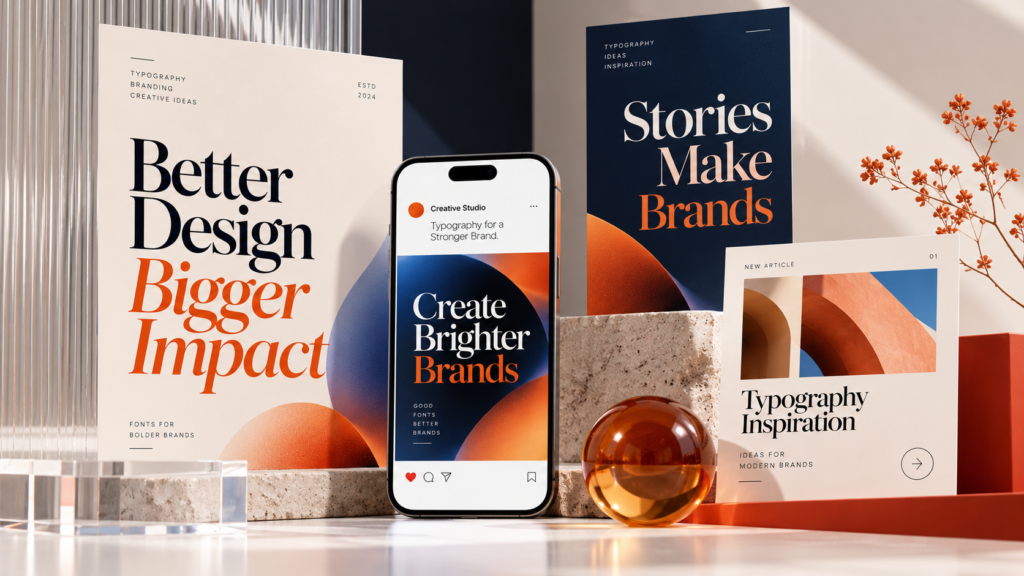
Marketing and social media
Consistent typography across campaigns helps customers recognize your brand even when the logo is not the main focus.
For web projects, make sure your font license permits the intended use. Desktop font licenses and webfont licenses may cover different applications, so review the relevant terms before publishing a website.
7. Choose a Font Family That Gives Your Brand Room to Grow
A typeface that works for a single logo may not provide everything a growing brand needs.
Consider how the font will perform as the business expands into new products, campaigns, and platforms.
A font family with multiple weights can help you build a consistent hierarchy without introducing unrelated typefaces. Italics, alternates, and variable font capabilities can also provide flexibility where supported and appropriate.
Before purchasing, consider the following:
Style range: Does the family include the weights and styles your project requires?
Character support: Does it include the language characters and special symbols you need?
File formats: Are the supplied formats compatible with your intended workflow?
Licensing: Does the license cover your planned logo, client work, advertising, packaging, or website use?
Long-term usability: Can the typeface support future design applications without losing brand consistency?
Choosing the right font is not just about how it looks today. It is also about whether it can support the brand as its visual needs evolve.
8. Explore Fonts for Your Next Branding Project
Once you understand your brand’s personality and typographic needs, the next step is to explore typefaces that fit your creative direction.
At Zeenesia Studio, you can explore distinctive typefaces for branding, logo design, editorial layouts, and other creative applications.
Consider starting with these collections, depending on the direction of your project:

Sugar Magic
Consider this bold sans serif family when your project needs a confident, contemporary typographic presence.
Explore the family and available licensing options on Zeenesia Studio.

Tropical Moraline
Explore this experimental sans serif family for distinctive display typography and expressive visual identities.

Helica
Consider this sans serif family for projects that need a coordinated typographic system across different weights and styles.
Find the right typeface for your next project.
Explore the full font collection at Zeenesia Studio and choose a typeface that matches your brand’s personality, design requirements, and licensing needs.
Editorial note: Before publishing, link each font name directly to its actual product page. Confirm the current product URL and available license options rather than linking all products to the homepage.
Frequently Asked Questions
What makes a font look premium?
A premium-looking font often combines distinctive letterforms, balanced proportions, appropriate spacing, and a style that matches the brand’s positioning. The final result also depends on typography hierarchy, layout, color, and how the font is applied.
Which font style is best for luxury branding?
Elegant serif fonts are a popular option for fashion, beauty, and editorial brands. However, modern sans serif fonts can also create a premium identity. The best choice depends on the brand’s personality, audience, and visual direction.
Can I use a free font for commercial branding?
Some free fonts permit commercial use, while others restrict it. Always review the font’s license before using it for a logo, client project, product packaging, or commercial website.
How many fonts should a brand use?
Many brand identities can work effectively with one or two complementary typefaces. Additional fonts should have a clear purpose and should not weaken the visual consistency of the identity.
Why is font licensing important for a brand?
Licensing determines how a font may legally be used. Logo design, desktop applications, advertising, and website embedding may be covered by different license terms. Always select a license that matches the actual project requirements.
Premium branding is not about choosing the most decorative typeface or following every typography trend. It is about making intentional decisions that communicate value, build recognition, and create a consistent visual experience.
By selecting the right font style, combining typefaces carefully, refining spacing, and applying typography consistently, designers can create brand identities that feel more distinctive and professional.
The right typeface does more than make a design look good. It helps communicate what a brand stands for.
At Zeenesia Studio, explore fonts that can help bring your next branding idea to life.