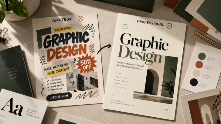
Why Your Graphic Design Looks Amateur (And How to Fix It)
Good graphic design is not simply about choosing attractive colors, downloading trendy fonts, or adding more decorative elements. Professional design is about making deliberate decisions that communicate a message clearly, create visual balance, and establish a consistent identity.
Yet even when a design contains beautiful elements, the final result can still look amateur. A poster may feel cluttered, a logo may lack character, or a brand presentation may look less sophisticated than the product it represents.
The problem is often not a lack of creativity. It is the way individual design elements work together.
The good news is that you do not always need to start over. By understanding a few fundamental design principles, you can identify what is weakening your work and make practical improvements.
Here are eight common graphic design mistakes that can make your work look amateur—and how to fix them.
1. Your Typography Lacks a Clear Hierarchy

Typography is one of the first things people notice in a graphic design composition. Before readers process every word, they perceive the size, weight, spacing, and overall arrangement of the letters.
When every element competes for attention, the design becomes difficult to understand.
A common mistake is using several bold typefaces, making too many words oversized, or giving headings and body text similar visual weight. The result is a composition without a clear starting point.
How to fix it
Establish a deliberate typographic hierarchy with three primary levels:
Headline: The main message, designed to attract attention.
Subheading: Supporting information that explains or expands the headline.
Body text: Details that readers can explore after understanding the main message.
Use differences in size, weight, spacing, and positioning to distinguish these levels. You do not need to make every element dramatically different; subtle, consistent contrast can be more effective.
For example, a promotional poster could use a large display serif for the headline, a clean sans serif for supporting information, and a smaller, readable type size for the details.
The goal is simple: readers should understand what matters most without having to figure it out themselves.
Typography tip: Choose typefaces based on their roles, not just their appearance. A distinctive display font can create personality, while a well-designed text face helps maintain readability.
Explore typefaces for branding and editorial projects at Zeenesia Studio.
2. You Are Using Too Many Fonts

A font can look beautiful on its own and still be the wrong choice for a particular design.
One of the most common design mistakes is using too many typefaces in a single composition. Each font introduces a different personality, and when those personalities conflict, the design loses consistency.
This is particularly noticeable in logos, packaging, social media graphics, and brand identity presentations.
How to fix it
Start with one or two complementary typefaces. Give each one a clear purpose.
A useful combination might include:
Display serif: For expressive headlines, premium branding, and editorial titles.
Sans serif: For supporting information, navigation, labels, and readable text.
You can create additional variety through font weights, italics, uppercase styling, and carefully selected OpenType features instead of introducing another unrelated font.
If your design needs a more distinctive personality, consider choosing a font family with multiple weights or a typeface with well-designed alternates and ligatures.
For instance, a luxury skincare brand might use an elegant serif for its product name and a restrained sans serif for ingredients and packaging information.
The result feels intentional because every typographic decision supports the same brand personality.
Professional rule: Font pairing is not about finding two fonts that look attractive together. It is about finding two fonts that perform different jobs while supporting the same visual direction.
3. Your Spacing Is Inconsistent

Spacing is one of the most underestimated elements in graphic design.
A layout can contain excellent typography and beautiful colors but still feel unfinished when the space between elements is inconsistent. Text may be too close to the edges, headings may feel disconnected from their paragraphs, or decorative elements may be crowded together.
Whitespace is not wasted space. It gives visual elements room to breathe and helps readers understand the relationship between them.
How to fix it
Create a simple spacing system before adjusting individual elements.
For example, you could use a consistent scale such as 8, 16, 24, 32, and 48 pixels for a digital layout. These values are starting points, not universal rules; adapt them to the size and purpose of your design.
Apply the system to:
Outer margins and internal padding.
Distance between headings and body text.
Gaps between images and captions.
Separation between unrelated content sections.
Pay attention to proximity. Elements that belong together should generally sit closer to each other than elements representing different sections.
Also, avoid filling every empty area simply because it looks unfinished. Sometimes removing a decorative element or increasing the whitespace creates a much stronger result.
Quick test: Step back from your design or view it at a smaller scale. If the composition looks crowded even when you cannot read the text, review your spacing before changing the colors or fonts.
4. Your Alignment Is Slightly Off

Alignment creates an invisible structure that makes a design feel organized.
When headings, images, captions, and supporting text are positioned without a clear relationship, the composition can appear accidental. Even small inconsistencies may make a polished design feel less professional.
This does not mean every element must always be centered or arranged symmetrically. Asymmetrical layouts can look sophisticated when they follow a deliberate system.
How to fix it
Establish a grid or alignment rule before placing your content.
For example, a magazine-style layout might align the headline and body copy along the same left edge while placing an image in a separate column. A centered poster might use a shared central axis to organize its headline, supporting text, and graphic elements.
Check the following:
Do related text elements share a consistent edge?
Are margins consistent across the composition?
Do images and captions align logically?
Are objects positioned intentionally rather than approximately?
Use alignment guides in your design software instead of relying entirely on visual estimation.
Remember that alignment is about relationships. A composition does not need perfect symmetry; it needs a structure that makes sense.
5. Your Color Palette Is Too Complicated

Color can give a design personality, but too many competing colors can weaken its visual direction.
A common mistake is selecting colors individually without considering how they work together. Bright backgrounds, saturated accents, contrasting text, and colorful decorative elements may all compete for attention.
This can make the design feel inconsistent, especially when the project is intended to communicate elegance, simplicity, or premium quality.
How to fix it
Build a limited color palette with clearly defined roles.
A practical starting point is:
Primary color: The dominant color that establishes the overall identity.
Secondary color: A supporting shade that creates variety.
Accent color: A carefully used color that highlights important information.
Neutral colors: Backgrounds and text colors that improve readability.
For a refined editorial identity, you might combine warm ivory, charcoal, muted olive, and a restrained terracotta accent.
For a technology brand, you might instead choose cool neutrals with a single vibrant accent.
Neither palette is inherently more professional. The right choice depends on the audience, industry, and message.
Always check contrast, especially for smaller text. A beautiful color combination is not successful if readers struggle to read the information.
Remember: Consistency matters more than the number of colors. A limited palette used thoughtfully often creates a stronger identity than a complicated palette without a clear purpose.
6. Your Design Has No Clear Focal Point

Every effective composition needs a visual starting point.
When several elements have similar size, contrast, weight, and prominence, the viewer does not know where to look first. This weakens the message and can make the design feel busy even when it contains relatively little content.
A strong focal point does not always have to be the largest object. It could be a striking headline, a distinctive typographic detail, a product illustration, or an unexpected use of negative space.
How to fix it
Decide what the audience should notice first, second, and third.
Then use visual contrast to establish that order.
You can create hierarchy through:
Scale: Make the most important element more prominent.
Contrast: Separate important content from its surroundings.
Position: Place key information where it naturally attracts attention.
Weight: Use typographic weight selectively.
Negative space: Give the focal point room to stand out.
For example, a font promotion graphic could feature one large type specimen, a short supporting headline, and a compact row of technical details.
Avoid making every element equally bold or decorative. When everything demands attention, nothing truly stands out.
Design exercise: Look at your composition for three seconds. What do you notice first? If it is not the message you intended to communicate, reconsider your hierarchy.
7. Your Typography Does Not Match the Brand Personality

Typography communicates more than words. It also communicates personality.
A typeface can feel elegant, playful, technical, nostalgic, editorial, or experimental. If its personality conflicts with the brand, the entire design can feel wrong even when the layout is technically sound.
Imagine a premium fragrance label using a playful cartoon-style font, or a children’s product brand using a highly formal typeface that feels cold and inaccessible.
Neither font is necessarily bad. The problem is the mismatch.
How to fix it
Start by defining three to five adjectives that describe the intended brand personality.
For example:
| Brand direction | Typography approach |
|---|---|
| Luxury and sophisticated | Refined serif, deliberate spacing |
| Modern and minimal | Clean sans serif, controlled hierarchy |
| Playful and expressive | Characterful display or rounded type |
| Editorial and artistic | Distinctive serif with strong contrast |
| Bold and energetic | Heavy display type with confident proportions |
Treat these as starting points rather than strict rules. The final decision should also consider legibility, the intended audience, and where the design will appear.
Once you establish a direction, apply it consistently across headlines, packaging, logos, promotional graphics, and supporting materials.
For designers working on brand identities, choosing the right typeface early can also make subsequent color and layout decisions much easier.
Explore the Zeenesia Studio font collection for typefaces that can help establish a more distinctive visual identity.
8. Your Design Looks Generic Instead of Distinctive

A design can be clean, balanced, and readable yet still feel forgettable.
This often happens when the composition relies entirely on familiar templates, predictable font choices, stock-style arrangements, or decorative elements that do not contribute to the concept.
Professional design is not about making everything unusual. It is about finding a visual idea that makes the work appropriate and recognizable.
How to fix it
Introduce a distinctive element that supports the central concept.
Depending on the project, this might include:
A display typeface with distinctive letterforms.
Carefully chosen ligatures or alternate characters.
A memorable typographic arrangement.
A custom illustration or original graphic motif.
An unexpected but purposeful color combination.
A unique layout that reinforces the brand’s personality.
Typography can be especially effective because letterforms carry both information and visual character.
For example, a boutique coffee brand might use expressive lettering for its main identity, restrained supporting typography for product details, and a consistent set of colors across its packaging.
The design feels distinctive because its elements work together to express one idea.
However, avoid adding effects or decorative details merely to make a design look different. Originality is most effective when it improves the concept rather than distracting from it.
9. A Final Design Checklist Before You Publish

Before exporting a design, take a few minutes to evaluate it objectively.
Use this checklist to identify common problems before they reach a client or become part of a published brand identity.
Design quality checklist
0/10
Copy checklist
Do not treat this checklist as a rigid formula. Some projects intentionally break conventional rules. The important distinction is whether the decision is deliberate and supports the message.
Conclusion: Professional Design Comes From Better Decisions
Graphic design does not look amateur simply because a designer lacks expensive software, advanced effects, or access to complicated techniques.
More often, the difference comes down to fundamental decisions: how typography communicates the message, how spacing organizes the layout, how color establishes mood, and how visual hierarchy guides the audience.
Start by identifying the weakest part of your composition instead of changing everything at once. Refine the typography, simplify the palette, correct the alignment, or remove unnecessary elements. Small, deliberate improvements can make a meaningful difference.
Most importantly, remember that professional design is not about following every trend. It is about creating work that is clear, consistent, appropriate for its audience, and memorable for the right reasons.
Looking to elevate your next design project?
The right typeface can help transform an ordinary layout into a more distinctive visual identity. Explore the font collection at Zeenesia Studio to discover typefaces for branding, editorial design, packaging, and creative projects.