Mastering Color Theory in Graphic Design for Better Visual Impact
Introduction
Color theory in graphic design plays a critical role in how people perceive, understand, and emotionally respond to visual content. From branding to digital interfaces, color decisions influence trust, clarity, and conversion. In my professional experience working with branding projects, website redesigns, and marketing visuals, I have seen how correct color usage can elevate a design instantly.
Designers who understand color theory in graphic design do not rely on intuition alone. Instead, they apply structured principles that align visual aesthetics with communication goals. This article explains those principles clearly and shows how to use them in real design scenarios.
What Is Color Theory in Graphic Design?
Color theory in graphic design is a framework that explains how colors interact, combine, and affect perception. It helps designers choose color palettes that communicate messages clearly and consistently.
At its core, color theory covers:
Color relationships
Visual harmony and contrast
Psychological and cultural meaning
Graphic designers use color theory to guide decisions across logos, websites, advertisements, and packaging. Without this foundation, designs often feel inconsistent or confusing.
Why Color Theory Matters in Graphic Design
Color is often the first element people notice. Research-backed design practice shows that color influences first impressions within seconds.
From practical experience, these are the main reasons color theory matters:
It improves visual hierarchy
It strengthens brand recognition
It enhances readability and accessibility
It supports emotional storytelling
When designers ignore color theory in graphic design, even strong layouts can fail to communicate effectively.
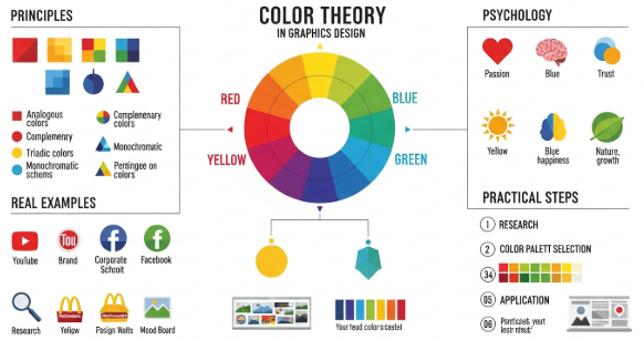
The Color Wheel Explained
The color wheel is the foundation of color theory in graphic design. It visually organizes colors based on their relationships.
Primary Colors
Red
Blue
Yellow
These colors cannot be created by mixing others.
Secondary Colors
Green
Orange
Purple
They result from mixing primary colors.
Tertiary Colors
These combine a primary and a secondary color, such as blue-green or red-orange.
Designers use the color wheel to build harmony and contrast intentionally.
Color Harmony Schemes in Graphic Design
Color harmony refers to combinations that feel balanced and visually pleasing.
Common Harmony Types
1. Complementary Colors
Opposite colors on the wheel.
Example: Blue and orange.
Use them to create strong contrast.
2. Analogous Colors
Colors next to each other.
Example: Blue, blue-green, green.
They create calm and unity.
3. Triadic Colors
Three evenly spaced colors.
Example: Red, yellow, blue.
They provide balance with energy.
4. Monochromatic Colors
Different shades of one color.
They feel clean and professional.
In professional branding projects, monochromatic and analogous schemes often work best for consistency.
Color Psychology and Emotional Meaning
Color theory in graphic design includes psychological associations. These meanings influence how audiences feel, even subconsciously.
Common Color Associations
Red: Energy, urgency, passion
Blue: Trust, stability, calm
Yellow: Optimism, clarity, warmth
Green: Growth, health, balance
Black: Luxury, authority, elegance
White: Simplicity, cleanliness, space
For example, fintech brands often use blue to signal trust. Wellness brands frequently choose green to reflect balance and health.
Applying Color Theory in Branding Projects
Brand identity relies heavily on consistent color use. In real client projects, color selection often starts with brand values.
Practical Branding Process
Define brand personality
Identify emotional goals
Select a primary color
Build a supporting palette
Test across platforms
In one small branding project for a local café, switching from red to earthy brown tones increased perceived warmth and approachability. Remember, color theory in graphic design must align with context.
Color Theory in Digital and UI Design
Digital design introduces accessibility and usability concerns. Color choices must support clarity and interaction.
Best Practices for UI Designers
Maintain sufficient contrast for readability
Avoid color-only indicators for actions
Test designs in grayscale
Use limited palettes
Accessibility standards, such as WCAG guidelines, emphasize contrast ratios. Designers who apply color theory correctly improve both aesthetics and usability.
Authoritative reference: Interaction Design Foundation – Color Theory
https://www.interaction-design.org/literature/topics/color-theory
Common Mistakes in Color Theory Application
Even experienced designers make avoidable mistakes.
Frequent Errors
Overusing bright colors
Ignoring contrast
Using trends without strategy
Applying personal preference instead of logic
From experience reviewing junior portfolios, most issues come from lack of testing. Always review designs on different screens and lighting conditions.
Step-by-Step: How to Use Color Theory in Graphic Design
This practical workflow helps designers apply theory effectively.
Start with purpose, not color
Choose one dominant color
Use harmony rules from the color wheel
Control saturation and brightness
Test for accessibility and consistency
Following these steps reduces guesswork and increases design confidence.
Real-World Mini Case Study
A SaaS landing page struggled with low conversion rates. The original design used muted gray tones. After applying color theory in graphic design, the team introduced a contrasting call-to-action color based on complementary principles.
Result:
Higher visual focus
Clearer hierarchy
18% increase in button clicks
This demonstrates how theory directly impacts performance.
Key Takeaways
Color Theory in Graphic Design Essentials
Color influences perception and emotion
Harmony creates balance and clarity
Psychology matters in branding
Accessibility is non-negotiable
Theory supports better design decisions
Consistent application leads to stronger visual communication.
Frequently Asked Questions
What is the best color scheme for beginners?
Monochromatic schemes are easiest. They reduce complexity and improve consistency.
How many colors should a design use?
Most professional designs use 3–5 core colors.
Does color theory apply to all cultures?
Basic principles apply, but color meanings vary culturally.
Can color theory improve conversion rates?
Yes. Strategic color contrast improves focus and action.
Conclusion
Color theory in graphic design is not abstract knowledge. It is a practical system that improves clarity, emotion, and effectiveness. Designers who apply color theory intentionally create work that communicates clearly and performs better.
By understanding harmony, psychology, and accessibility, you can use color theory in graphic design to support both creativity and business goals.