neo mint color trend 2026

Neo Mint: The Clean-Futuristic Color Dominating Design Trends in 2026

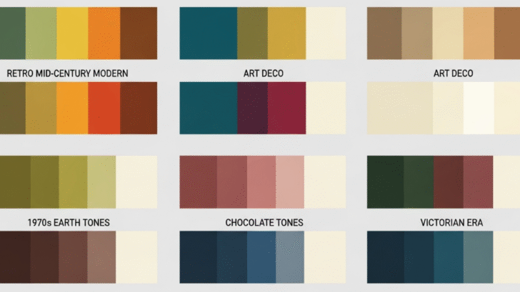
Color forecasting agencies and branding strategists agree: Neo Mint is one of the defining colors of 2026. Calm yet futuristic, natural yet technological, Neo Mint occupies a unique space in the design world—representing a future driven by sustainability, wellness, and scientific progress. As the world continues to embrace cleaner energy, minimalist living, and health-focused technology, …

Continue reading →

soft tech lavender futuristic color trend

🌐 Digital Lavender: The Soft-Tech Color Defining Design Trends in 2026

Introduction: A Color That Blends Calm and Futurism In 2026, Digital Lavender emerges as one of the most influential color trends across branding, fashion, UI/UX, and product design. This soft, futuristic shade of purple-lavender represents the intersection between technology, emotional wellness, and digital self-expression. As society becomes more connected yet overwhelmed by digital noise, Digital …

Continue reading →

earthy color palettes for branding 2026

Earthy Color Palettes: Why They Are Dominating Branding in 2026

Introduction: The Rise of Earthy Colors in Modern Branding In 2026, brands around the world are shifting toward earthy color palettes—warm browns, organic greens, muted beiges, terracotta reds, olive tones, and natural neutrals. This shift isn’t just a visual trend; it reflects deeper cultural movements toward sustainability, authenticity, and emotional comfort. Earthy colors connect brands …

Continue reading →

vintage color combinations for design

🌼 Vintage Color Combinations: How to Create Classic, Nostalgic, and Timeless Designs

⭐ Introduction Vintage design is more than just “old-fashioned” aesthetics—it’s a rich visual style inspired by the 1920s–1990s. One of the strongest elements shaping vintage visuals is color. Vintage color palettes typically feel warm, muted, nostalgic, earthy, and aged, creating emotional connections that modern designs often lack. In this guide, we explore the best vintage …

Continue reading →

psychology of blue color for designers

Blue Color Meaning in Design & How to Use It in Design

⭐ Introduction Blue is one of the most universally trusted and psychologically influential colors in design. It represents calmness, professionalism, stability, intelligence, and reliability. Because of its emotional neutrality and visual comfort, blue is the most widely used color in corporate branding, technology companies, healthcare, finance, and UI/UX interfaces. Understanding how blue affects human perception …

Continue reading →

red color meaning in design

The Color Red in Design: Meaning, Philosophy, and When to Use It Effectively

Color is one of the most powerful visual communication tools, and among all colors, red stands out as the most emotionally charged and attention-grabbing. It is the color of passion, strength, urgency, and intensity—qualities that can dramatically transform the tone and impact of a design. Understanding the philosophical meaning, psychological effects, and best use cases …

Continue reading →

Freelancer managing client communication and project workflow professionally.

Freelance Client Management Tips: How to Build Stronger Relationships and Secure Repeat Work

Managing clients effectively is one of the most powerful skills a freelancer can develop. Strong client relationships not only lead to smoother projects—they also turn into long-term partnerships, consistent income, referrals, and a stable freelance career. Whether you’re a designer, writer, marketer, developer, or virtual assistant, mastering client management helps you stand out in a …

Continue reading →