The Color Red in Design: Meaning, Philosophy, and When to Use It Effectively

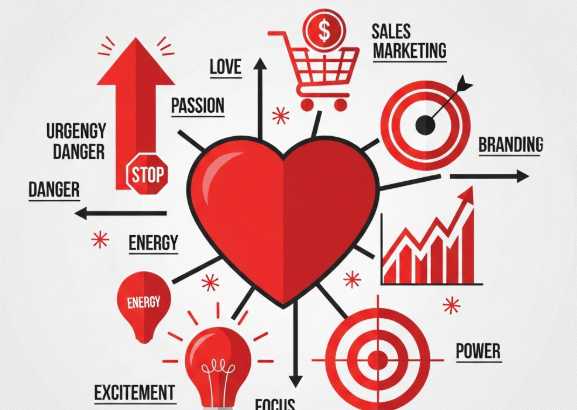
Color is one of the most powerful visual communication tools, and among all colors, red stands out as the most emotionally charged and attention-grabbing. It is the color of passion, strength, urgency, and intensity—qualities that can dramatically transform the tone and impact of a design.

Understanding the philosophical meaning, psychological effects, and best use cases of red allows designers to use this color with intention rather than guesswork. Below is a deep exploration of how the color red shapes perceptions and how you can strategically apply it in design.


1. The Philosophical Meaning of Red

Red carries a long history across cultures and philosophies. While interpretations differ, several universal meanings consistently appear:

🔥 1. Passion & Emotion

Red is widely associated with love, desire, enthusiasm, and intensity. It evokes strong emotional reactions more than any other color.

💪 2. Power & Courage

In many traditions, red symbolizes bravery, leadership, and strength. It is a color that commands respect and signals authority.

⚠️ 3. Warning & Attention

Red naturally draws attention and is often used to signal danger or urgency. Philosophically, this represents awareness and alertness.

❤️ 4. Life & Vitality

In ancient or cultural symbolism—Chinese, Indian, Western—red often represents life force, energy, and celebration.

🔥 5. Transformation & Action

Red is the color of movement and change. It suggests action, motivation, and decisive momentum.

Philosophically, red is not a “neutral” color. It always communicates something powerful—and this makes it a strategic choice in design.


2. Psychological Effects of Red

From a psychological standpoint, red triggers physical and emotional responses:

Increases heart rate

People feel more alert and energized when exposed to red.

Boosts attention and memory

Red objects are more likely to be noticed first compared to other colors.

Creates urgency

This is why red is used for sale signs, alerts, and warnings.

Stimulates appetite

Restaurants often use red because it subconsciously increases hunger.

Conveys confidence

Brands choose red to appear bold, assertive, and memorable.

Because red produces strong reactions, it must be used intentionally—too much can overwhelm the viewer, while the right amount can dramatically increase engagement.


3. What Types of Designs Work Best With Red?

Red is incredibly versatile, but it works especially well in specific design contexts.


✔ 1. Branding and Logo Design

Red is an excellent choice for brands that want to express:

  • Bold personality

  • Confidence

  • Energy

  • Excitement

Examples: Coca-Cola, YouTube, Netflix, Canon, Levi’s
These brands use red to appear dynamic, approachable, and emotionally engaging.


✔ 2. Marketing & Advertising

Red is often used in:

  • Urgent promotional banners

  • Flash sale graphics

  • Call-to-action buttons

  • Posters needing strong contrast

Red increases conversion rates, attention, and emotional drive.


✔ 3. Food & Beverage Design

Red stimulates appetite and excitement.

Perfect for:

  • Restaurant branding

  • Menu design

  • Food packaging

  • Fast-food advertising

Many food brands intentionally use red for this psychological effect.


✔ 4. Fashion & Luxury Design

Red conveys elegance, confidence, and sophistication.

Used in:

  • Haute couture branding

  • Perfume packaging

  • Luxury accessories

  • Editorial layouts

Deep reds and wine tones create a sense of richness and exclusivity.


✔ 5. Entertainment & Media Design

Red communicates excitement and bold energy.

Ideal for:

  • Movie posters

  • Music album covers

  • Streaming platform graphics

  • Video thumbnails

Red can increase click-through rates because it visually “pops.”


✔ 6. UI/UX and Digital Interfaces

Red is best used sparingly in digital design:

  • Notifications

  • Error messages

  • High-priority alerts

  • CTA buttons needing strong visibility (e.g., “Subscribe”)

Because red is intense, using it too often in UI makes the interface stressful.


4. When to Avoid or Reduce the Use of Red

Red is powerful—but it’s not always ideal. Avoid excessive use when a design requires:

❌ Calmness

(e.g., meditation apps, spa services, healthcare UI)

❌ Professional neutrality

(financial reports, corporate dashboards)

❌ Soft emotional tone

(parenting content, wellness content)

❌ Minimal distraction

(editorial designs prioritizing readability)

Using red incorrectly can create anxiety or make the design feel aggressive.


5. Best Practices for Using Red in Design

1. Use red as a strategic accent

A small amount of red can draw the eye to the most important element.

2. Pair it with neutral colors

White, black, grey, beige, or cream balance red’s intensity.

3. Choose the right shade

The meaning changes depending on the tone:

  • Bright red → energy, excitement

  • Dark red → elegance, luxury

  • Soft red → warmth, compassion

  • Neon red → modern, edgy

  • Muted red → vintage, artistic

4. Consider cultural context

Red can symbolize luck in China, mourning in South Africa, passion in Western culture.

5. Test accessibility

Red should not be used alone to convey critical information—especially in UX—for color-blind users.


Conclusion

Red is one of the most powerful colors in the visual spectrum, capable of influencing behavior, emotion, and decision-making. When used with intention, red can make a design more dynamic, persuasive, and memorable.

Designers who understand the philosophy, psychology, and contextual suitability of red can utilize this color to elevate branding, marketing, UI/UX, packaging, and visual communication.