Flat Design for Mobile Apps: A Complete Guide for Modern UI Success

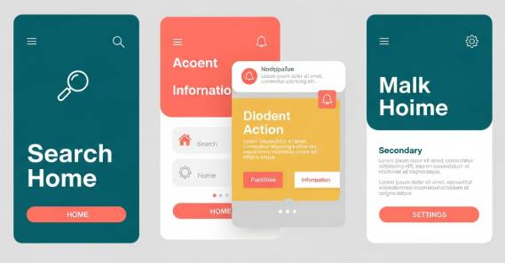
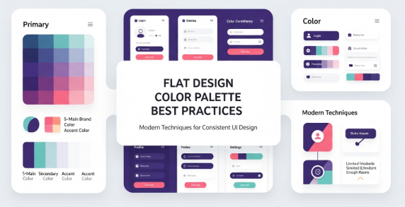
flat design for mobile apps has become a dominant approach in modern user interface design. From productivity tools to e-commerce platforms, designers increasingly choose flat visuals to improve usability, performance, and consistency across devices. Because mobile users expect speed and clarity, this design style continues to evolve as a practical solution rather than a passing trend.

In this article, you will learn what flat design really means, why it works so well on mobile platforms, and how to apply it correctly without harming user experience. Additionally, you will discover best practices, real-world examples, and common mistakes to avoid.


Understanding flat design for mobile apps

Flat design is a visual style that removes unnecessary decorative elements. It avoids heavy shadows, gradients, and textures. Instead, it focuses on clarity, color, typography, and spacing.

For mobile interfaces, this approach is especially effective. Smaller screens require efficient use of space. Therefore, flat design helps users focus on content and actions rather than visual noise.

Key characteristics include:

  • Solid color backgrounds

  • Simple iconography

  • Clean typography

  • Minimal UI elements

  • Clear visual hierarchy

However, flat design does not mean boring design. When used correctly, it creates elegant and intuitive mobile experiences.


Why flat design for mobile apps works so well

Several practical reasons explain the popularity of flat design for mobile apps.

First, flat interfaces load faster. Since they use fewer visual effects, they reduce processing demands. As a result, performance improves on low-end devices.

Second, flat layouts improve readability. Clear fonts and strong contrast help users scan content quickly. Therefore, accessibility also improves.

Third, flat design scales easily. Because it relies on vectors and grids, it adapts smoothly to different screen sizes and resolutions.

According to Google’s Material Design guidelines, simplicity and clarity are essential for mobile usability. You can review their official documentation here:
https://m3.material.io/


Core principles of flat design for mobile apps

To apply flat design effectively, you must understand its core principles.

Simplicity above all

Every element should serve a purpose. Remove anything that does not support user goals. For example, decorative shadows that add no function should be avoided.

Clear visual hierarchy

Use size, spacing, and color to guide attention. Important actions should stand out immediately. Therefore, users can complete tasks faster.

Consistent color usage

Flat design often relies on limited color palettes. Choose primary and secondary colors carefully. Additionally, ensure sufficient contrast for readability.

Typography-focused layout

Since visuals are minimal, text plays a larger role. Use legible fonts and consistent line spacing. Avoid overly decorative typefaces for body text.


flat design for mobile apps vs skeuomorphic design

Before flat design became popular, skeuomorphic design dominated mobile interfaces. Skeuomorphism imitates real-world objects, such as buttons that look like physical controls.

Flat design, however, removes these visual metaphors. Instead, it uses abstract cues like color and position.

Comparison overview:

  • Skeuomorphic design uses textures and shadows

  • Flat design uses clean shapes and colors

  • Skeuomorphism focuses on realism

  • Flat design focuses on usability and efficiency

While skeuomorphic design can feel familiar, flat design for mobile apps usually offers better performance and scalability.


Practical benefits for users and developers

Flat design does not only benefit users. Developers also gain advantages.

For users:

  • Faster navigation

  • Reduced cognitive load

  • Better readability

  • Cleaner visual experience

For developers:

  • Faster UI implementation

  • Easier maintenance

  • Better cross-platform consistency

  • Reduced asset complexity

Therefore, flat design becomes a strategic choice rather than a purely aesthetic one.


Common mistakes in flat design for mobile apps

Despite its simplicity, flat design can fail if applied incorrectly.

One common mistake is removing too much depth. When buttons look like plain text, users may not recognize them as interactive elements.

Another issue is poor contrast. Light text on light backgrounds reduces readability. Consequently, accessibility suffers.

To avoid these problems:

  • Use subtle shadows or color contrasts for clickable elements

  • Test designs under different lighting conditions

  • Validate accessibility with contrast tools

Flat design should remain functional, not minimal to the point of confusion.


Best practices to apply flat design correctly

To ensure success, follow these best practices.

  • Use color to indicate actions and states

  • Apply spacing consistently across screens

  • Maintain alignment using grid systems

  • Test interactions with real users

  • Combine flat visuals with micro-interactions

Additionally, consider adopting “flat 2.0,” which adds subtle depth through layering and motion. This approach preserves simplicity while improving usability.


Real-world examples of flat design for mobile apps

Many popular apps successfully use flat design principles.

Examples include:

  • Google Calendar with its clean color blocks

  • Spotify’s minimal navigation and typography

  • Airbnb’s simplified layouts and icons

These apps prove that flat design for mobile apps can be visually appealing and highly functional at the same time.


Typography and flat design for mobile apps

Typography plays a crucial role in flat interfaces. Since visual effects are limited, text clarity becomes essential.

Choose fonts with:

  • High legibility on small screens

  • Balanced letter spacing

  • Clear distinction between weights

Custom fonts can enhance brand identity. If you want to explore premium typography options, you can link to a font collection page such as:
[Insert internal link to related article here]


Performance and UX impact

Flat design positively impacts performance metrics. Fewer assets mean smaller app sizes. As a result, load times decrease.

From a UX perspective, users complete tasks faster. Clear layouts reduce decision fatigue. Therefore, retention rates often improve.

According to UX research, minimal interfaces help users focus on goals instead of decorations. This aligns perfectly with flat design philosophy.


Accessibility considerations

Accessibility should never be ignored. Flat design must still accommodate all users.

Important accessibility tips:

  • Maintain sufficient color contrast

  • Use readable font sizes

  • Ensure buttons are clearly identifiable

  • Support screen readers properly

By following these guidelines, flat design for mobile apps becomes inclusive and user-friendly.


Future trends in flat design for mobile apps

Flat design continues to evolve. Designers now blend it with motion design, subtle shadows, and responsive animations.

Upcoming trends include:

  • Soft gradients used sparingly

  • Micro-interactions for feedback

  • Adaptive layouts for foldable devices

  • Typography-driven UI systems

These innovations enhance flat design without compromising simplicity.


Conclusion

Flat design for mobile apps remains one of the most effective UI approaches for modern digital products. It improves performance, enhances usability, and supports scalability across devices. When applied thoughtfully, flat design delivers both aesthetic value and practical benefits.

By focusing on clarity, typography, spacing, and accessibility, designers can create mobile interfaces that feel modern and intuitive. Ultimately, flat design is not about removing elements, but about emphasizing what truly matters to users.

Frequently Asked Questions

Is flat design still relevant for mobile apps?

Yes, flat design remains highly relevant. It continues to evolve while maintaining its core principles of simplicity and usability.

Does flat design harm usability?

No, when applied correctly. Problems only arise when contrast and interaction cues are ignored.

Can flat design work for complex apps?

Yes. With strong hierarchy and spacing, flat design supports even feature-rich applications.

Is flat design suitable for all industries?

Most industries benefit from flat design. However, branding and audience expectations should guide final decisions.


Zeenesia Studio – Fonts that elevate your project.

Flat Design Inspiration for Modern, Clean, and High-Impact

Flat design inspiration continues to shape how digital products, brands, and interfaces communicate clarity, speed, and trust. In an era where users expect instant understanding, flat design delivers simplicity without sacrificing personality. From mobile apps to landing pages, this design approach remains a strategic choice for designers who value usability and visual efficiency.

Flat design inspiration is not just about removing shadows and gradients. Instead, it focuses on intentional choices, strong hierarchy, and purposeful color usage. Therefore, understanding its principles and practical applications is essential for designers who want to stay relevant and competitive.

This article explores flat design inspiration in depth. It covers principles, real-world use cases, visual trends, and actionable techniques you can apply today.


Understanding the Core of Flat Design

Flat design emerged as a response to overly decorative interfaces. It prioritizes function, speed, and clarity. As a result, interfaces become easier to scan and faster to load.

At its core, flat design uses two-dimensional elements. It avoids realistic textures, heavy shadows, and complex gradients. However, modern flat design often includes subtle depth cues to improve usability.

Key characteristics include:

  • Clean shapes and clear geometry

  • Bold, solid color palettes

  • High-contrast typography

  • Simple iconography

  • Strong visual hierarchy

Because of these traits, flat design inspiration remains highly adaptable across platforms and screen sizes.


Why Flat Design Still Matters Today

Flat design inspiration continues to thrive because user behavior demands clarity. Users scan more than they read. Therefore, designs must communicate instantly.

Additionally, flat design improves performance. Simpler visuals load faster and adapt better to responsive layouts. As a result, flat design supports both UX and SEO goals.

Modern brands also favor flat design. It feels contemporary, neutral, and scalable. Consequently, startups and global companies alike adopt it for consistency.


Flat Design Inspiration in User Interface Design

Flat design inspiration plays a major role in UI and UX projects. Interfaces benefit from reduced visual noise and clearer navigation paths.

Common UI applications include:

  • Mobile app dashboards

  • SaaS platforms

  • Web-based tools

  • E-commerce layouts

Designers often use spacing and color contrast to guide attention. Instead of relying on effects, hierarchy becomes the primary tool.

For example, call-to-action buttons stand out through color and placement rather than shadows. Therefore, users understand actions faster.

If you want more UI-focused examples, you can explore curated galleries on
https://www.behance.net


Flat Design Inspiration for Branding and Marketing

Branding thrives on consistency and memorability. Flat design inspiration supports both goals effectively.

Logos designed with flat principles scale well. They remain recognizable across social media, packaging, and digital ads. Additionally, flat visuals adapt better to animation and motion graphics.

Marketing materials also benefit from flat layouts. Posters, banners, and social media graphics appear clean and modern. As a result, messages feel more professional and trustworthy.

Flat design allows typography to take center stage. Strong fonts paired with simple visuals create immediate brand recognition.


Color Strategy in Flat Design

Color plays a central role in flat design inspiration. Since visual effects are minimal, color choices carry more responsibility.

Successful flat designs often use:

  • Limited color palettes

  • High-contrast combinations

  • Brand-aligned tones

Additionally, color psychology becomes more impactful. For example, blue communicates trust, while orange conveys energy.

However, restraint is essential. Too many colors reduce clarity. Therefore, designers often rely on one primary color supported by neutral tones.


Typography as a Visual Anchor

Typography is not secondary in flat design inspiration. Instead, it becomes a core visual element.

Sans-serif fonts dominate flat design. They feel clean, modern, and highly legible. However, expressive display fonts are often used for headlines to add personality.

Important typography practices include:

  • Clear font hierarchy

  • Consistent spacing

  • Strong contrast between headings and body text

Choosing the right font can elevate an otherwise minimal layout. This is why many designers invest in high-quality typefaces.

[Internal link placeholder: Insert link to a related typography or font guide article here]


Iconography and Illustration Styles

Icons and illustrations define the tone of flat design inspiration. They simplify complex ideas into recognizable symbols.

Flat icons use:

  • Simple shapes

  • Uniform stroke widths

  • Limited detail

Flat illustrations often feature:

  • Solid fills

  • Minimal shading

  • Abstract human figures

These visuals improve storytelling while maintaining clarity. Additionally, they integrate seamlessly into UI systems.


Flat Design Inspiration for Web Design Layouts

Web design benefits significantly from flat design inspiration. Pages load faster and feel easier to navigate.

Flat layouts typically feature:

  • Grid-based structures

  • Generous white space

  • Clear section separation

Because of these traits, users scroll more comfortably. Content becomes easier to digest, especially on mobile devices.

Flat design also pairs well with accessibility standards. High contrast and readable typography improve usability for all users.


Common Mistakes to Avoid in Flat Design

While flat design inspiration encourages simplicity, over-simplification can cause problems.

Common mistakes include:

  • Insufficient contrast

  • Unclear interactive elements

  • Overuse of bright colors

  • Weak hierarchy

Buttons must still look clickable. Links must still feel interactive. Therefore, subtle cues like color shifts and spacing remain essential.

Balancing simplicity with usability is the key to successful flat design.


Practical Tips to Apply Flat Design Inspiration

To apply flat design inspiration effectively, follow these actionable steps:

  1. Start with content structure before visuals

  2. Define a limited color palette early

  3. Use typography to establish hierarchy

  4. Replace effects with spacing and contrast

  5. Test usability on multiple screen sizes

Additionally, always validate your design with real users. Feedback ensures clarity and function.


Tools and Resources for Flat Design Inspiration

Several platforms provide excellent flat design inspiration for designers:

  • Dribbble for UI concepts

  • Behance for branding projects

  • Figma Community for design systems

These platforms showcase how professionals apply flat design in real projects. Studying them improves visual judgment and consistency.


The Future of Flat Design

Flat design continues to evolve. Modern trends blend flat principles with subtle depth, animation, and micro-interactions.

This evolution maintains clarity while enhancing engagement. Therefore, flat design inspiration remains relevant rather than outdated.

Designers who understand its foundations can adapt it to future trends with confidence.


Conclusion: Why Flat Design Inspiration Remains Essential

Flat design inspiration is more than a visual style. It is a strategic approach to communication, usability, and branding.

By focusing on clarity, hierarchy, and intentional simplicity, designers create experiences that feel modern and efficient. Additionally, flat design supports scalability across platforms and devices.

Whether you design apps, websites, or brand identities, flat design inspiration provides a reliable foundation for impactful visual work.


Frequently Asked Questions About Flat Design Inspiration

What is flat design inspiration best used for?
Flat design inspiration works best for digital products, branding, and marketing materials that prioritize clarity and speed.

Is flat design outdated?
No. Flat design continues to evolve with subtle depth and motion, keeping it relevant.

Can flat design work with expressive fonts?
Yes. Strong typography often enhances flat layouts when used intentionally.

How do I start using flat design inspiration?
Begin with content structure, choose a limited palette, and rely on hierarchy instead of effects.


Zeenesia Studio – Fonts that elevate your project.

Flat Design Color Palette and Modern Techniques

A flat design color palette plays a critical role in modern digital design. It shapes how users perceive a brand, interact with an interface, and interpret visual hierarchy. Designers value flat design because it uses simple forms, minimal shadows, and clean color blocks. Therefore, the flat design color palette becomes more than just an aesthetic choice. It becomes a functional tool that improves clarity, usability, and communication across screens and platforms.

Choosing the right flat design color palette helps designers create interfaces that feel intuitive and pleasant. In addition, it aligns brand identity with user experience. Because flat design removes depth and gradients, color must carry greater weight in guiding attention and expressing emotion. Therefore, refined color decisions improve both aesthetics and performance.

Understanding the importance of a flat design color palette is the first step. Next, you must explore how to select colors correctly, how to test them in real use cases, and how to apply them across UI components. This guide gives you actionable steps, practical examples, and insights grounded in current industry standards.


What Makes a Flat Design Color Palette Effective

An effective flat design color palette balances simplicity and contrast. It uses fewer shades, avoids heavy gradients, and focuses on harmony. Consequently, each color must be chosen carefully. The flat design trend values modern minimalism, legibility, and accessible contrast levels.

Key characteristics include:

  • Limited color range

  • Strong but simple contrasts

  • Accent colors for hierarchy

  • Neutral base tones

  • High readability

  • Accessibility compliance

The flat design color palette also emphasizes versatility. It should work across dark and light backgrounds, large and small components, mobile and desktop screens. To achieve that, designers consider palette flexibility early in the process.

Moreover, good palettes enhance user attention. Instead of overwhelming the viewer with gradients and textures, a flat design color palette uses bold but controlled hues. This approach simplifies scanning and strengthens comprehension.


Understanding Color Theory for Flat Design

Designers who master color theory can build stronger flat design color palettes. Hue, saturation, value, and contrast all matter. Although flat design avoids complex textures, color interactions still shape emotions and usability.

Consider:

  • Complementary colors create strong contrast.

  • Analogous colors support harmony.

  • Monochromatic palettes establish stability.

  • Split-complementary schemes balance contrast and calmness.

Additionally, the psychological effect of color cannot be ignored. For example, blue conveys trust and calmness. Red signals urgency and action. Green communicates growth and balance. When you choose a flat design color palette, consider both emotional resonance and readability.


Practical Steps to Build a Flat Design Color Palette

Follow these steps to craft a palette that supports clarity and appeal:

  1. Start with a neutral base: gray, white, off-white, or charcoal.

  2. Select one primary brand color that represents the product identity.

  3. Add accent colors for CTA buttons, alerts, and highlights.

  4. Ensure strong contrast for text and icons.

  5. Test the palette in light and dark modes.

  6. Validate accessibility using WCAG guidelines.

  7. Create color tokens for consistent usage.

Additionally, preview the palette in common UI components:

  • Headers

  • Navigation bars

  • Cards

  • Buttons

  • Icons

  • Backgrounds

This preview ensures your flat design color palette works in real context, rather than just in theory.


Tools for Creating and Testing a Flat Design Color Palette

Several tools help designers evaluate and refine palettes. They support color mixing, contrast testing, and accessibility validation. For example, the Material Design color guidelines offer practical advice and standards for digital products. You can explore them at https://material.io/design/color for authoritative guidance and up-to-date best practices.

Other helpful tools include:

  • Adobe Color

  • Coolors

  • Color Contrast Checker

  • HueSnap

  • Paletton

These tools streamline experimentation. Furthermore, they allow you to visualize how colors interact. Because flat design emphasizes clarity, such testing is essential for success.


Applying a Flat Design Color Palette in UI/UX

Once you finalize the palette, apply it strategically. Start with background layers and modular components. After that, ensure CTA buttons and interactive elements use the strongest accent colors. This approach improves recognition and boosts conversions.

Methods for applying the palette include:

  • Mapping colors to component tokens

  • Defining light and dark variations

  • Building accessible text contrast

  • Establishing hover and active states

Additionally, think about cross-platform consistency. Flat design color palettes must be scalable across:

  • Mobile apps

  • Websites

  • Software dashboards

  • Marketing collateral

Consistency supports brand recognition and user familiarity.


Accessibility Considerations

Accessibility is essential in flat design. Because shadows and gradients are limited, readability depends on color contrast. Therefore, designers must follow WCAG contrast guidelines. A flat design color palette succeeds when everyone, including users with visual impairments, can interact with it comfortably.

Key accessibility practices include:

  • Contrast ratio of 4.5:1 for body text

  • Testing color blindness variants

  • Avoiding color as the only communication method

  • Providing alternative visual cues

As a result, an accessible flat design color palette enhances inclusivity and usability.


Trends in Flat Design Color Palettes

Modern flat design continues to evolve. Although simplicity remains a core principle, new trends introduce fresh expressions. Currently, designers favor:

  • Soft pastel hues for relaxed interfaces

  • Bold neons for futuristic themes

  • Muted earth tones for sustainability branding

  • High-contrast duotone setups

  • Minimal monochromatic palettes

In addition, micro-interactions and motion graphics influence palette decisions. Flat design no longer excludes subtle depth. Instead, it blends minimalism with modern vibrancy.


Common Mistakes to Avoid When Building a Flat Design Color Palette

Even experienced designers make mistakes. You can avoid them by recognizing the pitfalls below.

Mistakes include:

  • Using too many colors

  • Ignoring accessibility

  • Overusing similar shades

  • Neglecting user context

  • Focusing only on aesthetics

Because flat design prioritizes clarity, palettes must support usability. Poor contrast or excessive complexity reduces effectiveness.


Case Studies and Real-World Applications

Real products demonstrate how flat design color palettes succeed:

  • Banking apps use blues and grays for trust and professionalism.

  • Fitness platforms use vibrant greens and oranges for energy.

  • Lifestyle brands use pastels for calm and elegance.

  • Productivity tools use bold accents for focus.

This diversity shows how a flat design color palette adapts across industries. Therefore, designers should tailor their palette to the target audience and brand message.


Workflow Integration

Integrating a flat design color palette into a design workflow increases consistency. Document colors in a style guide. After that, export palette tokens into the design system. Because teams often collaborate across locations, documentation ensures alignment.

Moreover, developers benefit from clear palette naming. UI libraries, CSS variables, and token systems contribute to reproducibility. Thus, product quality improves.


Conclusion

A thoughtful flat design color palette strengthens digital products through simplicity, clarity, and functionality. When designers use color intentionally, they create accessible and visually appealing interfaces. Moreover, this approach enhances branding and supports consistent user experience. Therefore, adopting strong palette practices is essential for modern design. By learning theory, testing tools, and applying structured workflows, you can master flat design color palettes and elevate your work effectively.


Zeenesia Studio – Fonts that elevate your project.

Modern Flat Design: A Complete Guide to Principles and Future Trends

systems transitioned from realistic aesthetics to flat visuals, the industry followed. Microsoft’s Metro interface and Google’s Material Design appeared as strong catalysts. These systems promoted simpler visual language. As adoption grew, brands recognized that minimal design improved comprehension, especially in busy digital environments. Therefore, modern flat design moved from a niche concept to a mainstream design approach.

Key Principles of Modern Flat Design
Several foundational principles define modern flat design and guide professionals as they develop layouts.

• Minimalism removes unnecessary elements.
• Functionality drives visual decisions.
• Typography supports clarity.
• Color assists hierarchy and focus.
• Icons communicate meaning quickly.
• Grids maintain alignment.

These principles encourage logical flow. They also ensure that visual structure supports user tasks. Consequently, designs become easier to understand and navigate. Although it appears simple, modern flat design requires discipline. Designers must remain selective about every detail.

Color Strategy in Modern Flat Design

Color plays a critical role in modern flat design because it creates contrast, hierarchy, and emotional tone. Designers frequently choose bright palettes. Additionally, harmonious color systems support readability. For example, bold primary tones can direct attention to call-to-action elements. Subtle gradients, when implemented carefully, add depth without violating flat principles. Moreover, neutral backgrounds improve legibility and reduce fatigue. When color aligns with accessibility standards, visual experiences become inclusive.

Typography and Legibility
Typography shapes user perception. Therefore, most designers select sans-serif fonts because they appear clean and easy to scan. Modern flat design encourages balanced spacing, consistent weight, and clear hierarchy. Headings must stand out; body text must remain comfortable for extended reading. Variable fonts help maintain flexibility across breakpoints. Additionally, modern flat design benefits from typographic restraint. Designers avoid ornamental fonts that distract from content.

Iconography and Microinteractions
Icons support navigation and streamline communication. Standardized shapes, stroke widths, and sizes maintain cohesion. When icons appear alongside readable labels, comprehension increases. Additionally, microinteractions improve usability. Small animations may highlight active states or confirm user actions. These elements enhance experience without compromising simplicity. Because modern flat design prioritizes function, these interactions remain subtle and purposeful.

Applications of Modern Flat Design in Digital Media
Modern flat design thrives in many environments. It strengthens:

• Website dashboards
• Mobile applications
• Brand identity systems
• Social media graphics
• Presentation slides
• Digital ads

Businesses adopt modern flat design because it conveys professionalism and clarity. Educational tools, e-commerce platforms, and enterprise software benefit as well. Simplified interfaces make it easier for users to complete tasks. As a result, conversions and engagement improve.

Benefits for User Experience
User experience improves with modern flat design because cognitive load decreases. Clean layouts allow users to identify key information quickly. Therefore, workflows become smoother. Additionally, modern flat design enhances performance. Without heavy textures and large image files, digital products load faster. Faster load times reduce bounce rates. Accessibility also improves due to clear contrast, larger tap targets, and simplified navigation. Designers achieve inclusive experiences more easily when they follow flat principles.

Branding and Marketing Advantages
Modern flat design reinforces brand trust. It projects confidence and professionalism. Logo systems adapt across print, mobile, and desktop. Because modern flat design relies on essential forms, it does not age quickly. Many brands prefer evergreen visuals. Consequently, marketing assets appear consistent and recognizable across campaigns. Sales materials and product pages benefit because modern flat design directs attention toward important messages.

Challenges and Critiques
Although modern flat design offers many strengths, it is not without challenges. Excessive minimalism may create ambiguity. Icons without supporting text can confuse new users. Designers must balance reduction with clarity. Visual cues should guide user actions. Additionally, too much white space might feel empty if not structured properly. Hierarchy must remain strong. Furthermore, color contrast must meet accessibility guidelines. These requirements ensure that minimalism does not hinder usability.

Modern Flat Design in User Interface and Experience (UI/UX)
User interface design governs how a product looks and operates. Modern flat design supports intuitive interaction because it reduces distractions. However, usability testing remains important. Designers must validate assumptions. They examine how different audiences perceive icons, spacing, and color. Because modern flat design emphasizes function, it pairs well with UX research. Additionally, responsive frameworks enhance performance across devices.

Trends Influencing the Future of Modern Flat Design
Modern flat design continues to evolve. Several notable trends are shaping its future.

• Soft gradients introduce subtle dimensionality.
• Neo-flat icons emphasize rounded geometry.
• Inclusive design focuses on accessibility.
• Motion design reduces static stiffness.
• Glassmorphism blends transparency and flat principles.

Additionally, artificial intelligence tools influence workflow. Design software now automates layout, color, and scale. Therefore, modern flat design becomes easier to implement. Although trends come and go, core principles remain consistent: clarity, function, and usability.

Practical Tips for Implementing Modern Flat Design
Designers who want to adopt modern flat design can follow several actionable steps:

• Choose a limited palette with strong contrast.
• Select legible sans-serif fonts.
• Maintain generous spacing to guide the eye.
• Use icons consistently.
• Test color accessibility.
• Keep navigation intuitive.
• Apply responsive breakpoints early.

Additionally, designers must consider real-world use cases. A layout that appears beautiful in theory may fail under heavy content. Therefore, testing remains essential. Iteration improves outcomes.

Case Study Example
Consider a mobile banking application. Traditional design might use shadows, textures, and metallic gradients. Modern flat design eliminates these extras. It employs solid colors to highlight primary actions, such as transfer or deposit. Iconography replaces decorative graphics. The result is an interface that loads faster, displays clearly in sunlight, and reduces cognitive effort. Consequently, customers complete transactions more efficiently.

Authoritative Reference
For further insights on accessibility and contrast, refer to the W3C guidelines: https://www.w3.org/WAI/fundamentals/accessibility-intro/

Internal Link Placeholder: [Insert link to related article about UI/UX principles here]

Conclusion
Modern flat design remains a powerful approach to visual communication. It delivers clarity and enhances function. Moreover, it aligns with business goals because it improves user engagement and supports accessibility. As digital products continue to evolve, modern flat design will adapt. It will integrate subtle depth, motion, and inclusivity while preserving simplicity. Therefore, organizations and designers who understand modern flat design will continue to create interfaces that feel contemporary, intuitive, and effective.

Frequently Asked Questions

What is modern flat design?
Modern flat design is a minimalist design style that focuses on clarity, usability, and essential elements while avoiding complex textures and realism.

Why is modern flat design popular?
It improves load time, readability, and accessibility. Additionally, it communicates professionalism and adapts across devices.

How does modern flat design differ from skeuomorphism?
Skeuomorphism relies on realistic visuals. Modern flat design removes decorative detail and emphasizes function and structure.

Where can modern flat design be used?
It appears in websites, mobile apps, branding systems, marketing campaigns, and educational platforms.

Zeenesia Studio – Fonts that elevate your project.

Flat Design Best Practices and Modern Trends for Digital Creators

Flat design has transformed how digital creators approach visual communication. The minimalist nature of flat design aligns with modern expectations for clarity, speed, and usability. Many designers rely on it for web interfaces, mobile apps, marketing assets, and branding elements. This article explains the principles, benefits, challenges, and future direction of flat design while offering actionable guidance for professionals who want to use it effectively. Additionally, it covers how flat design supports brand consistency and user engagement across digital platforms.

Flat design prioritizes simplicity. It strips away unnecessary decoration and complexity. This direct approach reduces visual noise, which helps users understand content faster. Because of this clarity, flat design is often selected for responsive interfaces and performance-focused products. It allows brands to communicate ideas quickly and efficiently. Furthermore, it integrates easily with contemporary UI and UX standards, which makes it a practical choice for many projects.

Flat design best practices rely on several pillars: hierarchy, balance, negative space, typography, and color discipline. Designers who understand these elements can craft polished, intuitive compositions. The emphasis on semantics and clarity supports broad audiences, including users who browse on small screens or limited bandwidth. Therefore, this approach aligns well with accessibility and usability goals. It also empowers creators who want to build scalable visual systems.

One of the main reasons flat design remains popular is its adaptability. The style has moved beyond its early “super-flat” appearance. Designers now integrate subtle gradients, depth, and micro-interactions. However, these enhancements do not undermine the fundamental simplicity of the approach. Instead, they highlight important content and guide user attention. Consequently, flat design continues evolving without losing its identity.

Understanding the Core Principles of Flat Design

Flat design requires a disciplined approach. Every element must serve a clear purpose. Therefore, designers must ask whether each shape, line, or color improves comprehension. If not, it should be removed. This mindset helps maintain a clean, cohesive visual system.

Key principles include:

  • Consistency in spacing, layout, and alignment.

  • Deliberate use of color contrast for hierarchy.

  • Simple shapes and icons that communicate ideas directly.

  • Limited decorative elements to avoid distraction.

  • Prioritizing legibility and clarity over ornamentation.

These principles support user-centered design. They also reduce complexity during development. For example, simple interface elements often require fewer resources to render, which improves load speeds. Faster interfaces lead to better usability metrics and higher conversion rates.

Why Flat Design Improves User Experience

User experience thrives on clarity. When visitors can understand information quickly, they engage more confidently. Flat design accelerates comprehension through recognizable patterns. Because many users expect minimalism today, they feel comfortable navigating flat interfaces. Additionally, clean layouts reduce cognitive load, so users can make decisions faster.

Speed is another advantage. Although visual styles alone do not guarantee optimal performance, flat design assets are often lightweight. This is especially helpful for mobile platforms where bandwidth is limited. Therefore, designers should explore flat design when optimizing for performance.

Furthermore, flat design promotes accessibility. High-contrast palettes support readability. Generous spacing and simple elements help screen readers interpret content. When designers combine flat design with accessible typography, the result can improve usability across wider demographics.

Modern Flat Design Trends Emerging Across Industries

Flat design trends continue to evolve. Several noteworthy directions include:

  • Soft gradients to add subtle depth.

  • Neumorphism hybrids, although used sparingly.

  • Simple animated icons that guide navigation.

  • Micro-interactions for feedback.

  • Inclusive color palettes aligned with WCAG guidelines.

These trends demonstrate that flat design is not static. It adapts to industry demands. Designers no longer avoid depth entirely. Instead, they apply it with intent. Furthermore, movement now plays a larger role in conveying hierarchy and feedback.

Color Psychology and Typography in Flat Design

Color plays a powerful role in flat design. Because the style avoids texture and realism, color becomes a primary tool for hierarchy. Designers should adopt limited palettes to prevent clutter. However, variation within a narrow scheme can produce sophisticated results. Therefore, color discipline is essential.

Typography must be equally intentional. Readability should be the main priority. Bold geometric sans-serif fonts often align well with flat design aesthetics. Their clean shapes support hierarchy and clarity. Furthermore, consistent type scales create cohesion across screens and layouts. Designers should avoid decorative typefaces unless they support the brand message.

Practical Application: How to Use Flat Design in Real Projects

Here are several practical steps for applying flat design:

  1. Begin with wireframes to establish hierarchy before decoration.

  2. Use color sparingly and rely on contrast for emphasis.

  3. Simplify icons and elements to their essential forms.

  4. Test interface readability across devices and screen sizes.

  5. Avoid ornamental shadows, textures, and gradients unless used subtly.

Additionally, real-world design projects benefit from prototyping tools. Software such as Figma or Sketch helps designers create iterations efficiently. Therefore, testing is central to great flat design.

Common Mistakes to Avoid When Implementing Flat Design

Flat design becomes ineffective when clarity suffers. A frequent mistake involves low-contrast color combinations. Without proper contrast, text becomes illegible. Another mistake is removing too much hierarchy. Designers must balance simplicity with guidance.

Another common issue involves icons. Flat icons should be recognizable instantly. If a symbol requires interpretation, it disrupts user flow. Furthermore, overuse of bright colors can overwhelm the interface. Designers must avoid visual noise even within minimalist compositions.

Flat Design and Branding: Building Cohesive Identity

A brand can leverage flat design to project a modern image. Consistent use of color, geometry, and typography helps establish recognizable identity assets. Because the style is clear and simple, it adapts well to various touchpoints. For example, a flat logo renders cleanly on mobile screens, print materials, and social media platforms.

Additionally, flat design supports scalability. Brands can extend the system into iconography, layout grids, and motion guidelines. Therefore, it functions well for organizations aiming to maintain coherent multiscreen presence.

Evaluating the Future of Flat Design in a Dynamic Digital Landscape

Flat design remains relevant. Although styles such as skeuomorphism and 3D art reemerge periodically, minimalism continues to dominate digital product design. Users expect fast, intuitive interfaces. Because flat design supports this expectation, it will likely remain influential.

However, the future may involve hybrid techniques. Depth and realism will appear where appropriate. Designers should embrace evolution while respecting clarity. In conclusion, flat design will continue shaping UI and UX across industries.

read also [Modern Flat Design: A Complete Guide to Principles, Benefits, and Future Trends]

To support further reading, explore authoritative materials on design systems and UI principles at Smashing Magazine: https://www.smashingmagazine.com

Conclusion: The Long-Term Value of Flat Design

Flat design offers a timeless approach to visual communication. It emphasizes clarity, simplicity, and performance. These traits align closely with user expectations and accessibility goals. Designers who apply flat design strategically can achieve clean, modern interfaces that engage users and support business objectives. Although creative trends continue shifting, flat design remains a strong foundation. It enables brands to communicate confidently in a crowded digital environment. By mastering color, typography, and hierarchy, creators can push the technique further while maintaining usability.

FAQ About Flat Design

What is flat design?
It is a minimalist visual style focused on clarity and direct communication without unnecessary decoration.

How does flat design support usability?
It reduces cognitive load and highlights important information through contrast, spacing, and hierarchy.

Is flat design good for branding?
Yes. It adapts easily to modern platforms and scales effectively across devices.

How can designers enhance flat design with depth?
They can apply subtle gradients, micro-interactions, and motion to add emphasis while retaining simplicity.

Why do users prefer flat interfaces today?
Users enjoy fast, intuitive interfaces with minimal distractions. Flat design satisfies this demand.

Zeenesia Studio – Fonts that elevate your project.