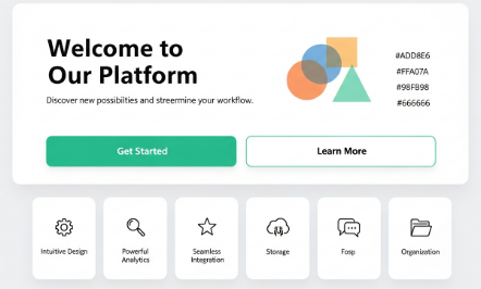
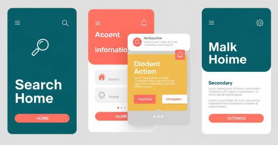
The Rise of Minimalist Design in 2026: How Less is More in Digital Branding

In an era where audiences are constantly bombarded with information, minimalist design has become more than just a trend—it’s a necessity for effective digital branding. In 2026, simplicity, clarity, and intentional design choices are dominating web design, UI/UX, and marketing materials. This guide explores why minimalist design matters, how it’s evolving, and practical tips for incorporating it into your projects.


What is Minimalist Design?

Minimalist design focuses on clarity, functionality, and elegance. It removes unnecessary elements and emphasizes whitespace, limited color palettes, and clean typography. The principle is simple: every design element should serve a purpose, enhancing user experience rather than overwhelming it.

Historically, minimalism in design began in the 1960s with architecture and visual arts, but in 2026, it has become a digital-first philosophy for branding and web experiences.


Why Minimalism Works in 2026

  1. Mobile-First Design: With over half of web traffic coming from mobile devices, minimalism ensures fast-loading, responsive layouts that are easy to navigate.

  2. Enhanced Usability: Minimalist interfaces reduce cognitive load, allowing users to focus on essential content and calls-to-action.

  3. Brand Clarity: Simpler designs make logos, typography, and messaging more memorable, enhancing brand recognition.

  4. Sustainable Design: Minimalism promotes efficiency, reducing unnecessary digital clutter and fostering more sustainable digital practices.


Color and Typography in Minimalist Design

1. Neutral Palettes

Minimalist designs rely on soft neutrals—white, beige, gray, and muted pastels. These colors create a clean, timeless look and make key elements like CTA buttons or illustrations pop.

2. Bold Accent Colors

Strategically placed accent colors help highlight important information or brand identity without overwhelming the user.

3. Typography Matters

Typography in minimalism is simple yet intentional. Designers favor sans-serif fonts, variable fonts, and geometric styles that enhance readability while maintaining elegance. Large headings paired with concise body text create a hierarchy that guides the user’s attention.


Case Studies: Minimalist Design in Action

  1. Apple: Their digital and physical branding emphasizes whitespace, clean typography, and functional simplicity.

  2. Airbnb: Focuses on intuitive navigation and visual hierarchy, using minimalistic layouts that highlight key content.

  3. Stripe: Uses whitespace, muted colors, and bold type to make complex financial tools approachable and easy to understand.


Practical Tips for Implementing Minimalism

  1. Embrace Whitespace: Let content breathe. Avoid filling every space with visuals or text.

  2. Limit Font Families: Stick to 1–2 fonts to maintain cohesion.

  3. Prioritize Essential Elements: Only include elements that serve a clear purpose.

  4. Use Color Strategically: Neutral backgrounds with one or two accent colors create balance and focus.

  5. Test Across Devices: Minimalism doesn’t mean sacrificing responsiveness—ensure your design works on all screen sizes.


Conclusion

In 2026, less truly is more. Minimalist design isn’t just visually appealing—it improves usability, enhances brand clarity, and creates digital experiences that resonate with modern audiences. By embracing clean layouts, purposeful typography, and thoughtful color use, designers can craft timeless, memorable, and effective digital branding that stands out in a crowded online space.

Color and Typography Trends in 2026: A Graphic Designer’s Guide

The world of graphic design is ever-evolving, with new trends constantly shaping how brands communicate visually. Staying ahead of the curve in color schemes and typography is crucial for designers, marketers, and business owners alike. In this comprehensive guide, we’ll explore the top color and typography trends for 2026, explain why they matter, and provide actionable tips for integrating them into your designs.


Why Color and Typography Trends Matter in 2026

Colors and fonts are more than just aesthetic choices—they influence perception, emotion, and brand recognition. Research shows that color increases brand recognition by up to 80%, and typography affects readability, engagement, and brand personality. As we enter 2026, design trends are increasingly driven by:

  • Digital-first experiences: Mobile, AR, and VR interfaces demand clean, readable typography and vibrant, accessible color palettes.

  • Sustainability and wellness focus: Earth tones, muted palettes, and organic fonts reflect environmental consciousness.

  • AI and generative design tools: AI-driven design helps experiment with unconventional colors and font pairings, setting new trends.

Understanding these forces ensures your designs remain contemporary, memorable, and effective.


Top Color Trends for 2026

1. Neo-Mint and Digital Pastels

Soft yet futuristic, neo-mint shades paired with pastel tones dominate UI and branding in 2026. They convey optimism, creativity, and a tech-forward mindset.

Example: Use neo-mint backgrounds with pastel illustrations for websites, app interfaces, and social media visuals.

2. Vivid Saturation for Attention

Bold, saturated colors like neon coral, electric blue, and vibrant purple are making a comeback in digital advertising and social media posts. These colors are excellent for grabbing attention in crowded digital spaces.

Pro Tip: Pair vivid colors with neutral backgrounds to avoid visual fatigue.

3. Earth-Inspired Palettes

Muted greens, terracotta, ochre, and sand tones reflect the rising emphasis on sustainability and environmental consciousness. They are perfect for eco-brands, wellness products, and lifestyle websites.

4. Gradient Revival

Gradients are returning, but with subtle sophistication—think soft ombré transitions and dual-tone gradients instead of harsh rainbow blends. Gradients work well for UI buttons, hero images, and modern branding logos.


Typography Trends to Watch in 2026

1. Variable Fonts

Variable fonts allow multiple weights and styles in a single font file, offering flexibility without sacrificing performance. Designers can use a single font for headlines, body text, and accents, creating a cohesive yet dynamic look.

2. Organic and Handwritten Fonts

Humanized typography with imperfect, hand-drawn aesthetics reflects authenticity. These fonts are popular in branding, packaging, and social media, offering a personal touch that stands out in a digital-first world.

3. Maximalist Type

Large, bold, and expressive type is making a comeback. From oversized headers to experimental letterforms, this trend demands attention and conveys confidence.

4. Retro-Futuristic Styles

Fonts inspired by 80s and 90s digital culture (think pixel, neon, and techno-inspired fonts) are appearing in web design, gaming, and entertainment branding. This trend blends nostalgia with modern tech aesthetics.


Practical Tips for Implementing 2026 Trends

  1. Balance Bold Colors with Neutrals – Avoid overwhelming users by pairing vivid colors with muted tones.

  2. Prioritize Readability – While expressive fonts are trendy, readability remains essential for UX.

  3. Test Across Devices – Ensure your colors and fonts render consistently on mobile, tablet, and desktop screens.

  4. Use AI Tools Wisely – Tools like Adobe Firefly or Canva AI can help explore color palettes and font pairings, but human judgment ensures design relevance.


Conclusion: Staying Ahead in 2026

As we step into 2026, color and typography continue to shape how audiences perceive brands and products. Neo-mint hues, bold gradients, and expressive typefaces are redefining the visual landscape. By understanding these trends and applying them thoughtfully, designers can create modern, memorable, and impactful designs that resonate in a fast-changing digital world.


SEO & EEAT Notes:

  • Primary Keyword: Color and Typography Trends 2026

  • Secondary Keywords: Graphic Design Trends, Neo-Mint Color, Variable Fonts, Branding 2026

  • Authoritative Voice: Cites research, trends, and practical examples.

  • Internal Links Suggestions: Link to pages about UI design tips, branding guides, or AI in design.

  • External Links Suggestions: Reference Adobe, Pantone, or design trend publications.

UI vs UX Design: What’s the Difference?

Although UI and UX are often mentioned together, they are not the same. In professional digital product development, each plays a distinct—yet interconnected—role in shaping the experience users have with an application, website, or system.

This article explains the definitions, differences, responsibilities, tools, and examples of UI and UX design in a clear and structured way, following professional and industry-standard references.


1. What Is UX Design?

User Experience (UX) Design focuses on how a product works, how it flows, and how users feel when interacting with it. It covers the entire journey—from the moment a user first discovers the product to the moment they complete a task or exit the experience.

Key Responsibilities of a UX Designer

  • User research: interviews, surveys, observation, persona creation

  • Information architecture: structuring content and navigation

  • User flows: mapping how users complete tasks

  • Wireframing: creating low-fidelity layouts for testing

  • Prototyping: building interactive flows for validation

  • Usability testing: identifying pain points and improving clarity

  • Product strategy: aligning design decisions with user needs and business goals

A UX designer essentially acts as the bridge between user needs and product functionality.

Core UX Goal:

👉 Make the product logical, useful, and easy to use.


2. What Is UI Design?

User Interface (UI) Design focuses on how a product looks, feels, and interacts visually. It is the layer that users see and touch.

Key Responsibilities of a UI Designer

  • Visual design: typography, color theory, iconography

  • Layout and spacing: grid systems, composition, visual hierarchy

  • Interactive elements: buttons, forms, toggles, sliders

  • Design systems: component libraries, style guides

  • Micro-interactions: animations, transitions, feedback messages

  • Brand translation: ensuring consistency across the interface

UI designers ensure the product’s aesthetic and visual language support the intended UX.

Core UI Goal:

👉 Make the product beautiful, consistent, and intuitive to interact with.


3. The Difference Between UI and UX Design

Although they work closely together, UI and UX have fundamentally different scopes.

AspectUX DesignUI Design
FocusExperience & functionalityVisual presentation & interaction
Concerned withUser needs, flow, structureInterface aesthetics & usability
DeliverablesPersonas, flows, wireframes, prototypesHigh-fidelity screens, components, style guides
ToolsFigma, Miro, Notion, UserTestingFigma, Adobe XD, Illustrator
Key Question“Does it work well?”“Does it look and feel right?”
OutcomeSmoother journeyAttractive, consistent interface

Both roles are essential: A great UI cannot fix a poor UX, and a great UX will be ignored without strong UI execution.


4. Real-World Examples of UI vs UX

Example 1: A Checkout Form

  • UX: Steps are simplified from 5 to 2. Optional fields removed.

  • UI: Button is designed with clear contrast and a visual hierarchy highlighting “Checkout Now.”

Example 2: A Food Delivery App

  • UX: Reduces ordering steps, auto-detects location, and surfaces restaurant recommendations.

  • UI: Uses consistent colors, appealing imagery, readable fonts, and large touch-friendly buttons.

Example 3: A Travel Booking Website

  • UX: Filters prioritize user needs (budget, duration, departure time).

  • UI: Clean layout, clear icons, and easy-to-read date selectors.

UX optimizes the journey, while UI optimizes the interface of that journey.


5. Why People Confuse UI and UX

The main reason: Most users see the interface, not the system beneath it.

To users:

  • A bad interface feels like “bad UX.”

  • Poor visual readability feels like “bad design.”

To designers:

  • UI and UX collaboration is inseparable.

  • UX informs what must be built, and UI defines how it is visually delivered.

This overlap leads to misconceptions—but ultimately, both roles aim to achieve the same goal:
👉 Create a product that satisfies users and supports business value.


6. Tools Used in UI and UX

Common UX Tools

  • Figma (low-fi wireframes)

  • Miro (mapping)

  • Notion (research organization)

  • UserTesting (validating concepts)

  • Axure (advanced prototyping)

Common UI Tools

  • Figma (high-fidelity UI)

  • Adobe Illustrator (icons and branding)

  • After Effects (micro-animations)

  • Zeplin (handoff)

Tools often overlap—especially in modern design workflows—but usage depth differs.


7. Which Career Path Should You Choose?

Your choice depends on your strengths, personality, and preferred type of problem-solving.

Choose UX If You Are:

  • Analytical

  • Curious about human behavior

  • Good at understanding problems and creating flows

  • Interested in strategy and research

  • Comfortable testing and iterating

Choose UI If You Are:

  • Artistic and visually driven

  • Interested in layout, typography, and color

  • Skilled in creating visually pleasing compositions

  • Detail-oriented (spacings, alignments, sizing)

  • Passionate about aesthetics and interactions

Choose Both (UI/UX) If You Want To:

  • Work in startups or small teams

  • Become a product designer

  • Manage end-to-end design processes

  • Create complete prototypes and interaction systems

Full-stack product designers are increasingly in demand, especially in digital-first companies.


8. Final Thoughts

UI and UX design are separate disciplines, but both are essential to building a successful digital product.

  • UX builds the structure.

  • UI builds the surface.

  • Together, they create an experience users trust.

Whether you aim to become a UI specialist, a UX researcher, or a full-stack product designer, mastering both perspectives will make you significantly more effective in the modern design ecosystem.

How to Use Gradients Effectively in Modern Design

Gradients are back — and they’re here to stay.
Once seen as outdated, gradients have made a massive comeback in modern design, bringing depth, vibrancy, and emotion to digital visuals.

From app interfaces to posters and logos, designers everywhere are using gradients to add energy and movement to their creations.
But to make them look professional, you need to understand how to use gradients the right way.

Here’s how to do it.


1. Understand the Purpose of Gradients

Gradients are more than just a visual trend — they’re a design tool.
They help guide the viewer’s eye, create focus, and give a sense of realism or mood.

Use gradients to:

  • Add depth to flat design elements.

  • Create emotional tone (warm for energy, cool for calmness).

  • Highlight key sections of your layout (like buttons or callouts).

💡 Tip: Don’t use gradients everywhere. Let them enhance, not overwhelm.


2. Stick to Simple Color Combinations

The best gradients are often built with just two to three colors.
Using too many shades can make your design look noisy or dated.

Try these classic combos:

  • Blue → Purple: Futuristic and digital.

  • Orange → Pink: Warm and energetic.

  • Teal → Green: Natural and modern.

Use tools like Coolors, Adobe Color, or UI Gradients to generate smooth transitions between tones.


3. Use Gradients to Support Your Brand

Gradients can express brand personality — bold, minimal, fun, or premium.
Think of Instagram’s famous gradient or Spotify’s duotone visuals.

If you’re creating a gradient for a brand, ask yourself:

  • Does it match the brand tone (energetic, soft, elegant)?

  • Will it work across different media (print, web, mobile)?

  • Is it recognizable even in grayscale or black-and-white versions?

Consistency is key — keep your gradient palette uniform across all platforms.


4. Experiment with Gradient Types

There’s more to gradients than just linear fades.
Modern tools let you explore multiple gradient styles:

  • Linear: Simple and elegant, best for backgrounds.

  • Radial: Creates focus from the center — great for logos or call-to-actions.

  • Conic (Angular): Adds a dynamic twist — perfect for abstract art or bold layouts.

  • Mesh gradients: Trendy, artistic, and used in many 2025 design portfolios.

🎨 Tools to explore:

  • Figma & Adobe Illustrator (mesh gradients)

  • CSS Gradient.io (web UI)

  • Blobs.app for organic gradient shapes


5. Ensure Accessibility and Contrast

While gradients are beautiful, they can sometimes reduce text readability.
Always check the contrast ratio between background gradients and text.

Tools like Contrast Checker or Stark Plugin for Figma help ensure your design remains accessible to all users.

👉 Pro Tip: Overlay a semi-transparent black or white layer to improve text visibility.


6. Keep It Trendy but Timeless

Gradients evolve every year.
In 2025, designers are moving toward soft pastel gradients and blurred backgrounds, inspired by nature and minimalism.

Still, remember — trends fade, but good design lasts.
Use gradients with purpose, not just aesthetics.


Conclusion

Gradients bring emotion and energy to modern design when used thoughtfully.
The key is balance — knowing when to go bold and when to stay subtle.
Mastering gradients means understanding color, light, and mood — skills every designer should refine in 2025.

So next time you open your design app, experiment with gradients.
You might find the perfect harmony between simplicity and vibrancy. 🌈