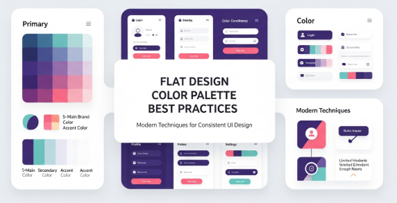
The Best Free Google Fonts Every Designer Should Use in 2026

Typography is one of the most powerful elements in design. The right font can elevate brand identity, improve readability, and create a stronger emotional connection with your audience. For designers working across digital, print, and UI/UX projects, choosing high-quality fonts is essential.

Fortunately, Google Fonts provides an extensive collection of free, open-source fonts that you can use for personal and commercial projects without licensing fees. With hundreds of families and thousands of styles, Google Fonts has become a global go-to resource for designers, developers, and content creators.

This article highlights the best Google Fonts that every designer should consider in 2026—complete with ideal use cases and expert recommendations.


⭐ Why Google Fonts Are a Must-Have for Designers

Before diving into the list, here’s why Google Fonts are so valuable:

✔ Totally free & open-source

Use for commercial, client, branding, UI, publishing—no hidden fees.

✔ Web-optimized & high performance

Google Fonts load fast, improving website speed and SEO.

✔ Massive library

Over 1,600+ font families updated regularly.

✔ Cross-platform compatible

Use across:

  • Figma

  • HTML/CSS

  • Canva

  • Adobe software

  • Mobile apps

  • Print design

✔ Professionally designed

Many fonts are created by top typography studios, ensuring high readability and consistency.


🔥 Top Google Fonts Designers Should Use in 2026

1. Inter — Best for UI/UX & Digital Interfaces

Inter is designed specifically for screens. Its large x-height improves readability even at small sizes.
Perfect for:

  • UI/UX

  • Apps

  • Dashboards

  • Web content

Why designers love it:
Clean, modern, and extremely flexible.


2. Roboto — The Universal Standard

Roboto remains one of the most widely used fonts globally. Balanced, readable, and stable.
Perfect for:

  • Web text

  • Mobile UI

  • Branding

  • Corporate design

Why designers love it:
Great for long reading and consistent across devices.


3. Poppins — Modern, Geometric, and Stylish

Poppins combines geometric shapes with softer curves.
Perfect for:

  • Headline

  • Posters

  • Social media design

  • Modern branding

Why designers love it:
Trendy, clean, and highly aesthetic.


4. Montserrat — Bold & Beautiful for Branding

Inspired by urban signage in Buenos Aires, Montserrat is geometric and impactful.
Perfect for:

  • Logos

  • Hero sections

  • Websites

  • Packaging design

Why designers love it:
Strong personality yet professional.


5. Open Sans — Extremely Readable for Long Text

One of the most versatile fonts in the world.
Perfect for:

  • Articles

  • Blogs

  • Documentation

  • Corporate documents

Why designers love it:
Warm, simple, and highly readable.


6. Lato — Friendly and Professional

Lato has a subtle elegance that works in both formal and casual contexts.
Perfect for:

  • Presentations

  • Websites

  • Business materials

  • Infographics

Why designers love it:
Balanced and visually pleasant.


7. Playfair Display — Elegant Serif for Premium Designs

A serif font with a high contrast stroke, ideal for classic or luxury themes.
Perfect for:

  • Editorial

  • Fashion brands

  • Magazine layouts

  • Wedding invitations

Why designers love it:
Creates sophisticated, high-end typography.


8. Oswald — Space-Saving Condensed Font

A tall, narrow sans-serif that commands attention.
Perfect for:

  • Headlines

  • Banners

  • Posters

  • Designs with limited horizontal space

Why designers love it:
Bold and easy to read even when condensed.


9. Raleway — Thin, Elegant, Minimal

A modern sans serif with a refined shape.
Perfect for:

  • Event posters

  • Branding

  • Editorial layouts

  • Portfolio sites

Why designers love it:
Clean elegance with high style impact.


🎯 Best Font Pairings (For Professional Designs)

Heading FontBody FontWhy It Works
MontserratOpen SansModern + readable
Playfair DisplayLatoElegant + friendly
PoppinsRobotoTrendy + balanced
RalewayInterStylish + screen-optimized
OswaldLatoBold + warm

Strong font pairings make your designs cohesive and professional.


📌 Tips for Choosing the Right Google Font

✔ Match the brand personality

Trendy brands → Poppins / Montserrat
Corporate → Roboto / Open Sans
Luxury → Playfair Display
Tech/UI → Inter

✔ Consider readability

Avoid overly thin fonts for small text.

✔ Use no more than 2 font families

Too many creates clutter.

✔ Test on different devices

Typography should scale beautifully across mobile, tablet, and desktop.


🔚 Conclusion

Google Fonts remains one of the most valuable free resources for designers in 2025. With thousands of high-quality font families available, you can craft beautiful typography for branding, UX design, print, and digital content—without worrying about licensing or costs.

Whether you need a clean UI font, an elegant serif, or a strong headline typeface, Google Fonts offers everything you need to create professional and visually stunning design work.

The Role of White Space in Modern Web Design

Introduction

In a digital world filled with noise, visual clutter, and endless content, users are constantly searching for websites that feel calm, intuitive, and easy to navigate. This is where white space—also known as negative space—plays a crucial role. Once seen merely as “empty space,” white space has become a core principle in modern web design, shaping visual hierarchy, readability, brand perception, and overall user experience.

White space is not wasted real estate; rather, it is a powerful design tool that helps users focus on what truly matters. In 2025, where clean interfaces and frictionless digital experiences define brand credibility, understanding white space is no longer optional—it is essential.

This article explores why white space matters, how it affects user engagement, and how designers can strategically apply it to create functional and visually compelling websites.


What Is White Space in Web Design?

White space refers to the empty or unmarked areas between design elements. It can appear between:

  • Text and images

  • Sections of a website

  • Margins and padding

  • Columns and paragraphs

  • Buttons and surrounding elements

Despite the name, white space does not have to be white. It can be any color, texture, or even a blurred background—as long as it provides breathing room in the layout.

White space comes in two main types:

1. Micro White Space

Small gaps between:

  • Letters

  • Lines of text

  • Buttons and icons

  • Form fields

  • Menu items

These details strongly affect readability and usability.

2. Macro White Space

Larger spaces between:

  • Sections

  • Columns

  • Hero banners and content

  • Images and body text

Macro white space creates visual flow and a sense of luxury and openness.


Why White Space Matters in Modern Web Design

1. Improves Readability and Comprehension

Studies show that proper spacing increases reading comprehension by up to 20%. When text feels cramped, the brain struggles to process content. White space helps:

  • Reduce cognitive load

  • Improve scanning

  • Make long content less intimidating

  • Highlight key messages

This is especially crucial for mobile users with smaller screens.


2. Strengthens Visual Hierarchy

White space helps designers guide users’ attention without using arrows or flashy animations. When used strategically:

  • Important elements stand out

  • Users naturally follow the intended flow

  • CTAs become more noticeable

  • The layout feels organized and intentional

A page with balanced spacing communicates professionalism and clarity instantly.


3. Enhances User Experience (UX)

A cluttered interface creates frustration and decision fatigue. White space:

  • Reduces overwhelm

  • Makes navigation intuitive

  • Encourages users to explore more pages

  • Provides moments of rest for the eyes

Good UX is not just about adding elements—but removing the unnecessary ones.


4. Creates a Premium, Modern Feel

High-end brands—from Apple to luxury fashion houses—use generous white space to convey elegance, simplicity, and exclusivity.

More space signals:

  • Confidence

  • Quality

  • Modernity

  • Professional craftsmanship

Minimalist design trends in 2025 make white space more important than ever.


5. Increases Focus and Conversions

When key elements have room to breathe, their importance increases. Designers can use white space to direct users toward:

  • A sign-up button

  • A pricing plan

  • A product image

  • A promotional banner

A famous Google study showed that simplified layouts improve user decision-making, which directly boosts conversions.


6. Improves Accessibility

Accessible design is non-negotiable today. White space supports accessibility by:

  • Making text easier to read

  • Helping assistive technologies parse information

  • Increasing touch-target spacing for users with motor impairments

Spacing is now part of WCAG (Web Content Accessibility Guidelines) recommendations.


Common Misconceptions About White Space

“White space is wasted space.”

White space increases user focus and conversion rates—it is an investment, not waste.

“White space makes pages too empty.”

Minimalist doesn’t mean empty. It means intentional, strategic, and functional.

“More content means more value.”

Crowded interfaces actually make users leave faster. Clarity beats complexity.


Best Practices for Using White Space Effectively

1. Use Consistent Spacing Rules

Spacing should follow a predictable system. Many designers use:

  • 4-point system

  • 8-point system

  • Modular scale spacing

Consistency builds visual harmony.


2. Increase Line Height for Better Text Reading

Ideal line height ranges:

  • 1.4–1.6 for body text

  • 1.2–1.3 for headings

This boosts readability dramatically.


3. Add More Space Around CTAs

Buttons should never feel squeezed. Extra padding improves:

  • Touch accuracy

  • Visual contrast

  • Click-through rate (CTR)


4. Use Macro White Space Around Key Sections

Hero banners, testimonials, and feature sections look more premium with breathing room.


5. Don’t Overdo It

Too much white space can:

  • Make content appear disconnected

  • Force excessive scrolling

  • Reduce information density where needed

Balance is key.


6. Prioritize Mobile Optimization

Small screens need:

  • More padding

  • Clear spacing

  • Wider touch zones

  • Stacked layouts

Mobile white space should feel generous but not excessive.


Examples of Effective White Space in Web Design

Apple

Large margins, centered content, and minimal text—creates a clean, premium feel.

Google

Simple layouts and generous spacing help users focus on functionality.

Airbnb

Uses white space to highlight photography and improve browsing comfort.


How White Space Impacts User Behavior

White space subtly guides how users:

  • Interpret information

  • Scan pages

  • Make decisions

  • Experience your brand

Sites with proper spacing typically see:

  • Longer time on page

  • Lower bounce rates

  • Higher conversions

  • Better user satisfaction

In short: white space influences both emotions and actions.


The Future of White Space in Web Design

As interfaces become more adaptive, AI-assisted, and personalized, white space will evolve too. Expect:

  • More fluid spacing

  • Responsive spacing systems

  • AI-optimized layouts

  • Larger macro space in premium websites

  • Stronger emphasis on minimalism and clarity

White space will remain a fundamental pillar of modern digital design.


Conclusion

White space is one of the most powerful tools in modern web design. It improves readability, enhances visual hierarchy, supports accessibility, increases conversions, and elevates brand perception. Rather than viewing it as empty space, designers should recognize white space as the invisible structure that holds a design together.

A layout with thoughtful spacing feels modern, professional, and user-friendly—exactly what audiences expect

Choosing the Right Website Color Scheme for User Engagement

Color is not just a visual preference—it is a central component of effective web design. Whether a user browses a homepage, clicks a product page, or interacts with a call-to-action button, color plays a key role in how they feel, where they look, and what actions they take. In today’s competitive digital landscape, choosing the right color scheme can dramatically increase engagement, improve user experience, and boost conversions.

In this article, we explore the psychology behind colors, best practices for creating a web-friendly palette, and practical strategies for aligning colors with your brand’s goals.


Why Website Color Scheme Matters

A well-chosen color scheme influences three major components of web interaction:

1. First Impressions

Users form an opinion about a website within milliseconds. Studies show that color is responsible for up to 60% of these judgments.
If your palette feels outdated, inconsistent, or overwhelming, users may leave before exploring further.

2. Emotional Influence

Color impacts mood and behavior.
Warm colors (reds, oranges) can energize and draw attention, while cool colors (blues, greens) promote trust and calmness.

3. User Navigation and Flow

Colors can guide the eye, highlight important actions, and create visual hierarchy.
Good color contrast also increases readability—an essential part of accessibility and user experience.


Understanding Color Psychology in Web Design

Although color perception varies between cultures and individuals, some color associations are generally universal.

Red — Attention, Urgency, Excitement

Great for calls-to-action, promotions, and alerts.
However, overuse may feel aggressive.

Blue — Trust, Security, Stability

Frequently used in:

  • Corporate websites

  • Financial services

  • SaaS companies

Blue relaxes viewers and encourages continued browsing.

Green — Balance, Growth, Nature

Great for eco-friendly products, wellness brands, and calming interfaces.

Yellow — Optimism, Energy, Creativity

Effective for brands wanting to appear friendly and cheerful.
Use sparingly to avoid visual fatigue.

Black — Luxury, Strength, Professionalism

Minimalist brands often pair black with white or gold for a premium look.

Purple — Imagination, Luxury, Uniqueness

Perfect for beauty, artistic, and high-end services.

Orange — Action, Confidence, Encouragement

Often used for call-to-action buttons thanks to its strong visibility.

White — Cleanliness, Minimalism, Simplicity

A strong base color for modern and mobile-first designs.


Types of Website Color Schemes

1. Monochromatic

Uses variations of a single color (different shades, tones, tints).
Benefits: simple, clean, cohesive.
Best for: minimalistic or calming websites.

2. Analogous

Uses colors next to each other on the color wheel.
Example: blue + teal + green
Benefits: harmonious and visually pleasing.

3. Complementary

Uses two colors opposite each other on the wheel.
Example: blue + orange
Benefits: high contrast and dynamic energy.

4. Triadic

Uses three evenly spaced colors on the wheel.
Example: red + blue + yellow
Benefits: balanced but expressive.

5. Neutral + Accent

Uses white/gray/black as the base with one bright accent.
Most modern websites use this approach because it’s flexible and clean.


How to Choose the Right Color Scheme for Better User Engagement

To create a high-performance color palette, designers and businesses follow these strategic steps:


1. Define Your Brand Personality

Ask yourself:

  • Is your brand playful or serious?

  • Modern or traditional?

  • Bold or calm?

A tech brand may choose blue for trust and innovation, while an artisanal bakery may use warm, earthy tones for comfort and authenticity.

Brand personality → Color direction


2. Understand Your Audience

Different demographics react differently to colors.
Examples:

  • Younger audiences prefer vibrant colors

  • Professionals prefer muted tones

  • Luxury consumers respond to minimalist palettes

Design must align with audience psychology—not personal preference.


3. Study Competitor Palettes (But Don’t Copy Them)

Observe patterns in your industry:

  • Are most competitors using blue?

  • Are bright colors common?

  • Are minimalist palettes dominating?

This helps you decide whether to blend in or differentiate.

Goal: Stand out while remaining industry-appropriate.


4. Choose a Primary Brand Color

Your primary color defines the overall mood and appears on:

  • Headers

  • Logos

  • Buttons

  • Navigation

Select a color that best represents your core message.
Examples:

  • Trust (blue)

  • Excitement (red)

  • Clean modernity (white)

  • Sustainability (green)


5. Add 2–3 Secondary Colors

Secondary colors support the primary color and add visual balance.
These appear on backgrounds, cards, icons, and illustrations.

Make sure they complement—not compete with—the primary color.


6. Choose an Accent Color for CTAs

Accent colors are critical for conversion.
They should:

  • Stand out clearly

  • Be limited to CTA elements (buttons, key links)

  • Contrast well with the background

Popular accent colors: orange, green, red, yellow.

Consistency is key.


7. Test Colors for Usability and Accessibility

Good design must be inclusive.
Check for:

  • Sufficient color contrast

  • Readability on mobile screens

  • Visibility in light vs dark mode

  • Accessibility for color-blind users

Tools like WCAG contrast checkers ensure compliance.


8. Evaluate Colors Across Real Pages

Never finalize colors without previewing them on real content.
Test them on:

  • Landing pages

  • About page

  • Checkout form

  • Blog design

  • Mobile screens

Colors may look great on a color wheel but terrible with real UI elements.


Common Color Mistakes to Avoid

❌ Using too many colors

This confuses users and dilutes brand identity.

❌ Choosing colors based on personal taste

Business goals come first.

❌ Low contrast combinations

This hurts usability and reading comfort.

❌ Inconsistent color usage across pages

Reduces user trust and professionalism.

❌ Overusing bright or saturated colors

Can overwhelm the viewer and feel unbalanced.


Examples of Successful Color Strategy

1. Google — Multi-Color Trust & Playfulness

Bright but balanced, representing creativity and diversity.

2. Dropbox — Calming Blue for Simplicity

Blue communicates clarity and reliability.

3. Spotify — Black + Neon Green

Striking contrast suited for music and modern entertainment.

4. Airbnb — Soft Red/Pink Comfort Tone

Warm, friendly, and community-focused.

5. Apple — Black, White, and Silver Minimalism

Premium, clean, and timeless.


How Colors Affect User Engagement & Conversions

A well-chosen color palette improves:

1. Click-Through Rates

High-contrast CTA buttons improve visibility and action-taking.

2. Time on Page

Comfortable colors encourage longer browsing sessions.

3. Readability

Proper contrast improves comprehension and reduces eye fatigue.

4. Trust & Perceived Credibility

Users trust websites that look polished and cohesive.

5. Emotional Response

Right colors trigger the desired feelings—calmness, excitement, luxury, etc.


Creating a Consistent Color Experience

To maintain strong brand identity, document your colors in a brand style guide, including:

  • Primary, secondary, and accent colors

  • Hex, RGB, and CMYK codes

  • Light vs dark variations

  • Usage rules

  • Incorrect usage examples

This ensures design consistency across web, mobile, and printed media.


Conclusion: Choose Colors With Strategy, Not Impulse

A website’s color scheme is more than decoration—it is a silent communicator that shapes user perception, guides navigation, and influences conversion rates. By understanding color psychology, selecting a strategic palette, ensuring accessibility, and keeping consistency, brands can create websites that feel trustworthy, visually appealing, and highly engaging.

Every color sends a message.
Make sure your website is sending the right one.

The Power of Color in Graphic Design: How to Use Color Psychology to Boost Branding and Engagement

Introduction

Color is one of the most powerful tools a graphic designer can use. Beyond aesthetics, it conveys emotion, influences perception, and impacts decision-making. In branding and marketing, understanding color psychology is critical for creating visuals that engage audiences and reinforce brand identity.

This guide explores the role of color in graphic design, how to use it effectively, and practical tips for boosting branding and engagement through strategic color choices.


Why Color Matters in Graphic Design

Color is more than a visual element—it’s a language that communicates without words. Its importance lies in:

  • Emotional Impact: Colors evoke feelings like trust, excitement, or calmness.

  • Brand Recognition: Consistent color use increases brand recall.

  • User Behavior: Color can influence actions, from clicking a button to purchasing a product.

Designers who master color psychology create more compelling and memorable designs.


Understanding Color Psychology

Different colors carry different meanings and emotional associations. Here’s a brief overview:

  • Red: Energy, passion, urgency. Often used in sales or calls-to-action.

  • Blue: Trust, professionalism, calm. Common in corporate and tech brands.

  • Yellow: Optimism, warmth, attention-grabbing. Great for highlights and playful brands.

  • Green: Growth, health, stability. Used in eco-friendly, wellness, and finance brands.

  • Orange: Creativity, enthusiasm, friendliness. Works well for youth-oriented or dynamic brands.

  • Purple: Luxury, creativity, sophistication. Popular in beauty and high-end branding.

  • Black: Power, elegance, sophistication. Ideal for minimalist or premium brands.

  • White: Purity, simplicity, cleanliness. Used for contrast and minimalism.


How to Use Color Strategically in Graphic Design

1. Align Colors with Brand Personality

Your color palette should reflect your brand values and audience expectations. For example:

  • A financial service may favor blue for trust and reliability.

  • A children’s product may use bright, playful colors to engage young audiences.

2. Consider Cultural Context

Colors have different meanings across cultures. For instance:

  • White symbolizes purity in Western cultures but mourning in some Asian cultures.

  • Red is considered lucky in China but may indicate danger in Western contexts.

Always consider your audience’s cultural background to avoid misinterpretation.

3. Use Contrast for Readability

High contrast improves readability and accessibility:

  • Text should contrast with the background (e.g., dark text on a light background).

  • Buttons and calls-to-action should stand out using complementary colors.

4. Limit Your Palette

Too many colors can overwhelm viewers. A simple palette of 2–4 primary colors plus accent colors often works best.

5. Create a Visual Hierarchy

Use color to guide the viewer’s eye:

  • Highlight important elements with bold or bright colors.

  • Use muted tones for background or secondary content.

6. Test for Accessibility

Ensure your color choices are accessible:

  • Use color-blind-friendly palettes.

  • Test contrast ratios for readability.


Tools for Choosing the Right Colors

  • Adobe Color: Create harmonious palettes and explore trends.

  • Coolors: Generate color schemes quickly and easily.

  • Canva Color Palette Generator: Ideal for beginners and marketing visuals.

  • Color Safe: Helps create accessible color combinations.

Using these tools helps designers experiment and make informed decisions.


Case Studies: Brands Using Color Effectively

  1. Coca-Cola (Red): Evokes energy, excitement, and passion, making the brand instantly recognizable.

  2. Apple (White & Minimalism): Uses clean, neutral colors to emphasize simplicity, elegance, and innovation.

  3. Spotify (Green): Represents creativity and growth, appealing to a youthful and dynamic audience.

These examples show how strategic color use reinforces brand identity and audience engagement.


Trends in Color for 2025

  • Bold, vibrant gradients: Dynamic and eye-catching digital designs.

  • Soft pastels: Calm, approachable, and modern aesthetics.

  • Dark mode palettes: High contrast, sleek digital experiences.

  • Neo-memphis and retro color schemes: Playful, nostalgic, and attention-grabbing.


Conclusion

Color is a designer’s most powerful tool. By understanding color psychology, cultural context, and strategic use, designers can create visuals that capture attention, communicate emotions, and strengthen brand identity.

Whether you’re designing a logo, website, or social media campaign, the right color choices can boost engagement, influence decisions, and leave a lasting impression.