color theory in graphic design explained with color wheel

Color Theory in Graphic Design: Principles, Meaning, and Use

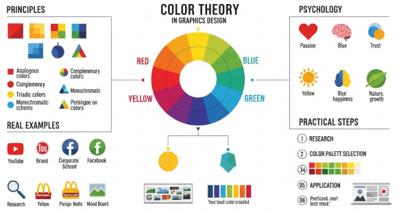
Mastering Color Theory in Graphic Design for Better Visual Impact Introduction Color theory in graphic design plays a critical role in how people perceive, understand, and emotionally respond to visual content. From branding to digital interfaces, color decisions influence trust, clarity, and conversion. In my professional experience working with branding projects, website redesigns, and marketing …

Continue reading →

color theory for designers explained with a color wheel and palettes

Color Theory for Designers: Master the Art of Choosing Colors

Mastering Color Theory for Designers: A Complete Guide Introduction Understanding color theory for designers is essential for creating visually appealing and effective designs. Designers who master color theory can guide viewers’ emotions, create brand consistency, and improve usability in web and print projects. Based on my years of experience designing digital products and branding campaigns, …

Continue reading →

solar apricot color trend 2026

Solar Apricot: The Warm-Tech Color Setting the Tone for 2026 Design Trends

Color trends in 2026 are shifting toward emotional warmth, human connection, and subtle optimism—yet still blending seamlessly with the sleek world of digital aesthetics. Among these rising stars, Solar Apricot emerges as one of the most influential colors shaping branding, UI, fashion, packaging, interior design, and digital visuals. Solar Apricot is a soft, luminous peach-orange …

Continue reading →

soft tech lavender futuristic color trend

🌐 Digital Lavender: The Soft-Tech Color Defining Design Trends in 2026

Introduction: A Color That Blends Calm and Futurism In 2026, Digital Lavender emerges as one of the most influential color trends across branding, fashion, UI/UX, and product design. This soft, futuristic shade of purple-lavender represents the intersection between technology, emotional wellness, and digital self-expression. As society becomes more connected yet overwhelmed by digital noise, Digital …

Continue reading →

psychology of blue color for designers

Blue Color Meaning in Design & How to Use It in Design

⭐ Introduction Blue is one of the most universally trusted and psychologically influential colors in design. It represents calmness, professionalism, stability, intelligence, and reliability. Because of its emotional neutrality and visual comfort, blue is the most widely used color in corporate branding, technology companies, healthcare, finance, and UI/UX interfaces. Understanding how blue affects human perception …

Continue reading →

Hyper-saturated color palette with bold neon hues and vibrant gradient combinations used in modern graphic design.

Chromatic Boldness: The Return of Hyper-Saturated Color Palettes

For years, minimalist color palettes dominated the design landscape. Soft neutrals, muted pastels, and clean Scandinavian-inspired tones shaped everything from branding to packaging. But as we enter 2026 and beyond, a dramatic shift is happening. Designers are abandoning safe color choices and embracing chromatic boldness—a resurgence of hyper-saturated color palettes that demand attention, provoke emotion, …

Continue reading →